The results are displayed on the Results tab. The option buttons selected in the Data Mappings panel determine the number of plots that are created in the Results tab. A Settings file is also generated containing all selections made in the object interface.
To make the graph bigger or smaller, click  or
or  in the toolbar. Each click changes the display by 10%.
To resize the graph to fill the display area as much as possible click  .
.
To refresh the display, click  .
.
To move or pan the figure in the display area, hold the space bar down on your keyboard while dragging the graph. The  icon in the toolbar changes to
  while the space bar is pressed. (Refer to the note below.)
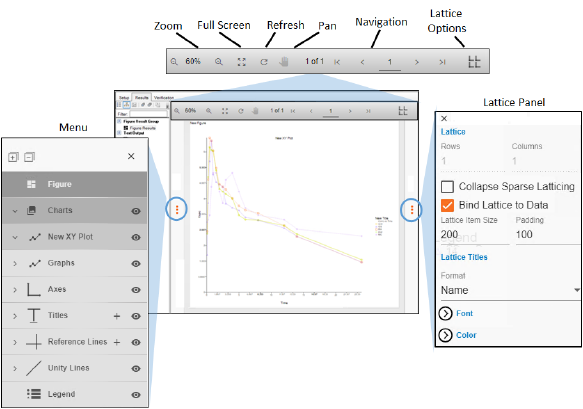
Use the navigation icons in the toolbar to display other graphs generated in the output. These icons are only present in the toolbar when latticing options have been set in the Setup panel.
Note on use of trackpads for panning: When it comes to using trackpads on a laptop for pan operations, sensitivity settings can prevent the trackpad from enacting on user input. For laptops with Synaptics trackpads, we found that reducing the Palm Check Threshold setting to the minimum sensitivity will allow the trackpad to enact on input while holding the spacebar for pan operations.
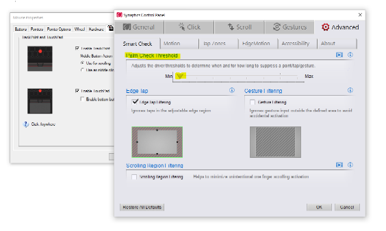
Other device types may/may not perform panning operations correctly. If they do not, try identifying a setting similar to Synaptics’ Palm Check Threshold and reducing it.
All customization is accomplished from the Results tab.
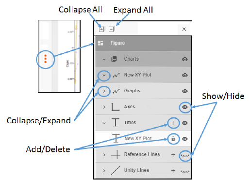
Click the triple red dots on the left side of the display area to expand the left panel and access all of the customizable parameters available for the displayed chart. The expanded panel is set up hierarchically, with each level having its own shade of gray. The lower the level, the lighter the shade of gray.
Figure is the highest level. A figure can have one or more charts (listed under the Charts heading) and each chart has categories of customizable options (e.g., graphs, axes, titles, reference lines, unity lines, and legend options). The categories vary depending on the type of chart. Use the collapse/expand arrows to the left of the headings to navigate through the levels. Notice that there are also icons to the right of some of the headings. Their functions are shown in the previous figure.
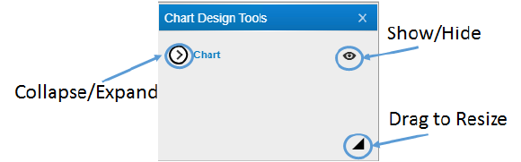
If there are settings associated with a heading, double-clicking it will display a popup. There are some common aspects to all of these popups, as shown in the following figure.
To find out more about chart customization, click one of the following links:
•Axis
Each graph type also has opportunities for customization. Click one of the following graph links to view the options:
