•Change marker style and color
Customization of group lines is available for Area graphs, Box plots, Categorical graphs, Horizontal bar graphs, Vertical bar graphs, and XY graphs.

-
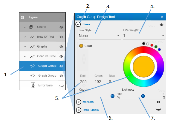
Under the name of the graph, double-click Graph Group.
There will be a separate Graph Group heading for each unique value of the Group variable. -
In the Graph Group Design Tools popup, click Lines to view the settings.
-
Use the Line Style pulldown menu to choose the style for the group line (None displays a solid line).
-
Enter the thickness for the line in the Line Weight field.
-
Click in the color wheel to select a color (or you can click one of the smaller circles to choose a more standard color). Alternatively, enter the RGB value for the desired color in the Red, Green, and Blue fields.
-
Adjust the Opacity of the color by moving the ball along the line. The farther to the right, the more solid the color, the farther to the left, the more transparent.
-
Adjust the Lightness of the color by moving the ball along the line. The farther to the right, the more white is mixed with the color, the farther to the left, the more black is mixed with color.

-
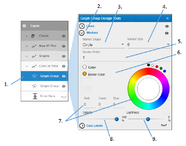
Under the name of the graph, double-click Graph Group.
There will be a separate Graph Group heading for each unique value of the Group variable. -
In the Graph Group Design Tools popup, click Markers to view the settings.
-
Select the shape for the data point markers from the Marker Shape pulldown.
-
Select the size of the marker from the Marker Size pulldown.
-
Select the width for the border around the marker from the Border Width pulldown.
-
Select the radio button of the item to change.
-
Click in the color wheel to select a color (or you can click one of the smaller circles to choose a more standard color). Alternatively, enter the RGB value for the desired color in the Red, Green, and Blue fields.
-
Adjust the Opacity of the color by moving the ball along the line. The farther to the right, the more solid the color, the farther to the left, the more transparent.
-
Adjust the Lightness of the color by moving the ball along the line. The farther to the right, the more white is mixed with the color, the farther to the left, the more black is mixed with color.

-
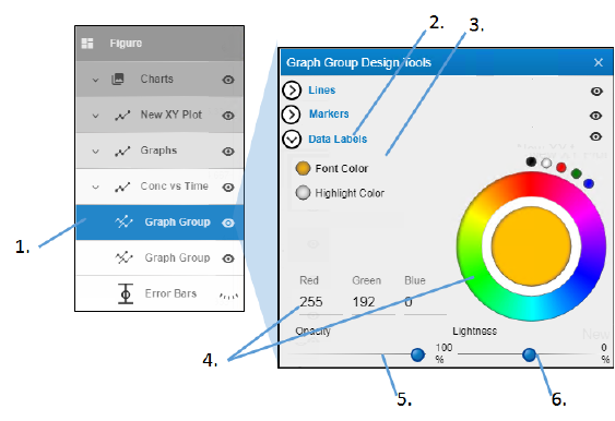
Under the name of the graph, double-click Graph Group.
There will be a separate Graph Group heading for each unique value of the Group variable. -
In the Graph Group Design Tools popup, click Data Labels to view the settings.
-
Select the radio button of the item to change.
-
Click in the color wheel to select a color (or you can click one of the smaller circles to choose a more standard color). Alternatively, enter the RGB value for the desired color in the Red, Green, and Blue fields.
-
Adjust the Opacity of the color by moving the ball along the line. The farther to the right, the more solid the color, the farther to the left, the more transparent.
-
Adjust the Lightness of the color by moving the ball along the line. The farther to the right, the more white is mixed with the color, the farther to the left, the more black is mixed with color.
