•Change marker shape and color
•Change ordering of the X-axis
•Change axis scale or range (Y-axis only)
Customization is also available for the following:
•Axis

-
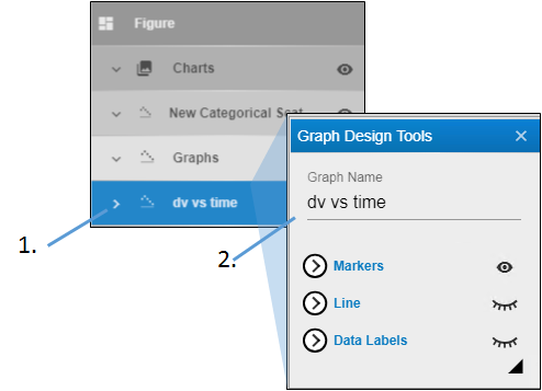
Expand the Graphs heading and double-click the name of the graph.
-
In the Graph Design Tools popup, edit the name in the Graph Name field.

-
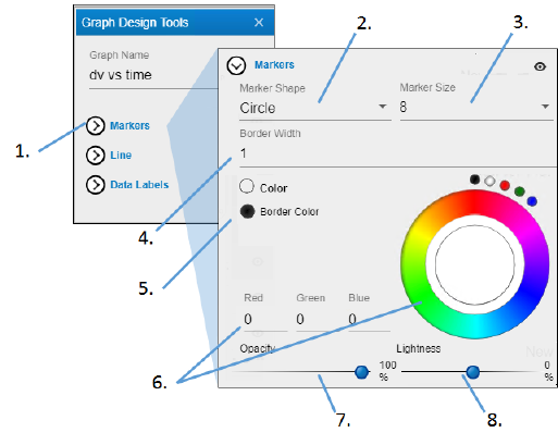
Click Markers to view the settings.
-
Select the shape for the data point markers from the Marker Shape pulldown.
-
Select the size of the marker from the Marker Size pulldown.
-
Select the width for the border around the marker from the Border Width pulldown.
-
Select the radio button of the item to change.
-
Click in the color wheel to select a color (or you can click one of the smaller circles to choose a more standard color). Alternatively, enter the RGB value for the desired color in the Red, Green, and Blue fields.
-
Adjust the Opacity of the color by moving the ball along the line. The farther to the right, the more solid the color, the farther to the left, the more transparent.
-
Adjust the Lightness of the color by moving the ball along the line. The farther to the right, the more white is mixed with the color, the farther to the left, the more black is mixed with color.

-
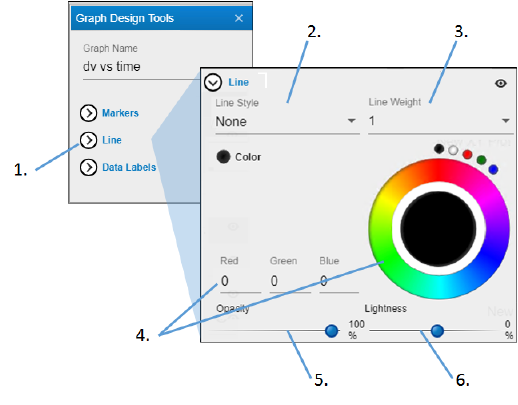
Click Line to view the settings.
-
Select the style for the line connecting the data points from the Line Style pulldown (None displays a solid line).
-
Select the width of the line from the Line Width pulldown.
-
Click in the color wheel to select a color (or you can click one of the smaller circles to choose a more standard color). Alternatively, enter the RGB value for the desired color in the Red, Green, and Blue fields.
-
Adjust the Opacity of the color by moving the ball along the line. The farther to the right, the more solid the color, the farther to the left, the more transparent.
-
Adjust the Lightness of the color by moving the ball along the line. The farther to the right, the more white is mixed with the color, the farther to the left, the more black is mixed with color.

-
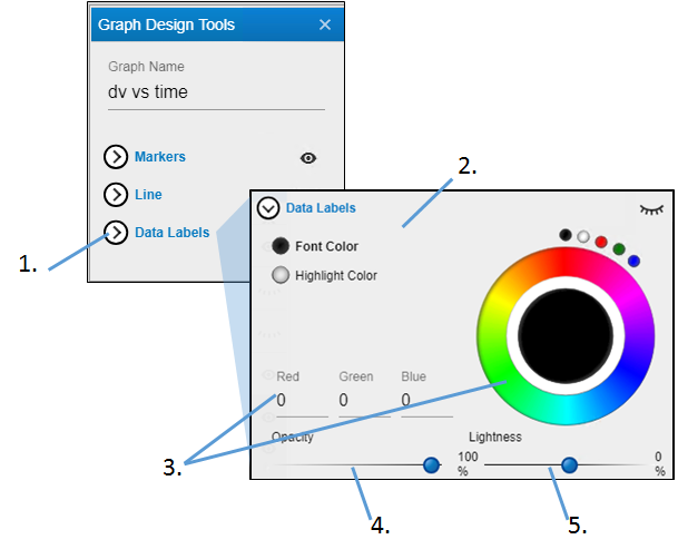
Click Data Labels to view the settings.
-
Select the radio button of the item to change.
-
Click in the color wheel to select a color (or you can click one of the smaller circles to choose a more standard color). Alternatively, enter the RGB value for the desired color in the Red, Green, and Blue fields.
-
Adjust the Opacity of the color by moving the ball along the line. The farther to the right, the more solid the color, the farther to the left, the more transparent.
-
Adjust the Lightness of the color by moving the ball along the line. The farther to the right, the more white is mixed with the color, the farther to the left, the more black is mixed with color.
