•Change graph name and boundaries
Customization is also available for the following:
•Axis
Change graph name and boundaries

-
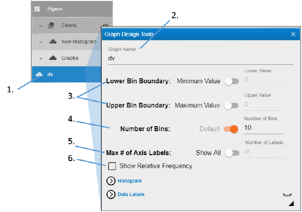
Expand the Graphs heading and double-click the name of the graph.
-
In the Graph Design Tools popup, edit the name in the Graph Name field.
-
To set a value for the Lower and Upper Bin Boundary, turn off the Minimum value switch and enter the value in the Lower Value field.
The default (switch is on) is to use the lowest and highest values of the variable mapped to the Distribution context. -
To set the Number of Bins, turn the Default switch off and enter the value in the Number of Bins field.
-
To set the Maximum # of Axis Labels, turn off the Show all switch and enter the value in the Number of Labels field.
-
Check the Show Relative Frequency box to display the relative frequency on the Y axis. The default frequency display is a simple frequency.

-
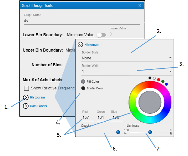
Click Histogram to view the settings.
-
Use the Border Style pulldown menu to choose the style for the outline of the bars (None displays a solid line).
-
Enter the thickness for the outline of bars in the Border Width field.
-
Select the radio button of the item to change.
-
Click in the color wheel to select a color (or you can click one of the smaller circles to choose a more standard color). Alternatively, enter the RGB value for the desired color in the Red, Green, and Blue fields.
-
Adjust the Opacity of the color by moving the ball along the line. The farther to the right, the more solid the color, the farther to the left, the more transparent.
-
Adjust the Lightness of the color by moving the ball along the line. The farther to the right, the more white is mixed with the color, the farther to the left, the more black is mixed with color.

-
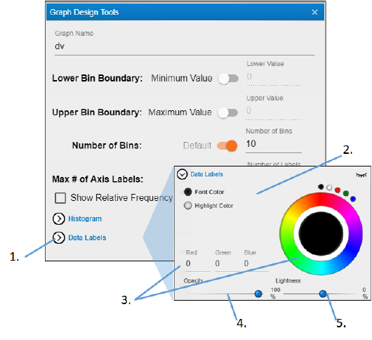
Click Data Labels to view the settings.
-
Select the radio button of the item to change.
-
Click in the color wheel to select a color (or you can click one of the smaller circles to choose a more standard color). Alternatively, enter the RGB value for the desired color in the Red, Green, and Blue fields.
-
Adjust the Opacity of the color by moving the ball along the line. The farther to the right, the more solid the color, the farther to the left, the more transparent.
-
Adjust the Lightness of the color by moving the ball along the line. The farther to the right, the more white is mixed with the color, the farther to the left, the more black is mixed with color.
