Data Mappings panel
Plot Options tab
Plot Layout Options tab
Plot Lattice Options tab
Axes Options tab
Graphs Options tab
Legend Options tab
Reference Lines Options tab
Annotations Options tab
Plot objects in Phoenix share a set of common controls that allow users to configure the plot display. Plot options are located in the Options tab, which is located underneath the Setup tab. Users can select one of five main categories in the navigation tree to display the corresponding group of display options. The categories are the same for all plots except Scatter Plot Matrix (which does not have Legend or Reference Lines options).
Most menu options in the Options tab can be used to format the plot display before or after the plot object is executed. Options that do not automatically update the plot display are noted.
Use the Data Mappings panel to identify how input variables are used in a Plot object. Separate plots can be created for each profile. Required input is highlighted orange in the interface.
None: Data types mapped to this context are not included in the output.
X: The independent variable axis. Note that, for Bar plots, this axis is the vertical axis. A single X mapping is required for Column, Bar, XY, and X-Categorical XY plots.
Y: The dependent variable axis. A single Y mapping is required for Box and QQ plots. Mapping of either Y or Y2 is also required for XY, X-Categorical XY, Bar, and Column plots.
Y2: The secondary dependent variable axis. This axis is displayed on the top of each plot.
Included: Variables used to create a Scatter Plot. At least two variables must be mapped to this context.
Data Label: Labels for data points on the X axis.
Distribution: Variable used to create the Histogram plot quartiles. A single Distribution mapping is required.
Group: Only for Bar, Column, Box, and XY plots. Groups the X axis based on the selected variable.
Grouping: Only for X-Categorical XY plots. None: Data types mapped to this context are not grouped. Grouping Group: Displays the data points using different data point markers based on the variable mapped to this context. Any data type in a dataset can be mapped to Group even if it is also mapped to the independent and dependent variables contexts.
Lattice Conditions: Row: Separates the plots into multiple rows based on the selected variable or variables. (See “More on latticed plots in Phoenix”.) Not available for Scatter Plots. Column: Separates the plots into multiple columns based on the selected variable or variables. Not available for Scatter Plots. Page (Sort): Separates the plot by page based on the selected variable. Allows users to sort a plot by a variable or variables.
Error Bars: Error bars represent the overall distribution of the data and are used to indicate how closely the means of the data reflect the true values. Error bars are only available for XY, and X-Categorical XY plots, and for Column plots that have no Group mapping. (See “Set up error bars”.) Lower Error Bar: Error bar lengths or coordinates down the Y-axis. Upper Error Bar: Error bar lengths or coordinates up the Y-axis. Different variables in a dataset can be mapped separately to the Lower and Upper Error Bar contexts.
More on latticed plots in Phoenix
Latticing data is a way of arranging a plot display based on a sort key. For example, if a dataset contains columns for subjects, time of dose, and concentration, it is possible to create a graph that displays time versus concentration for each subject if subject is selected as a sort key.
There are two ways to arrange a latticed graph: by row and by column. If a graph is latticed by subject, and there are three subjects in the dataset, Phoenix can create three graphs on one page that are displayed as either three rows or three columns.
The Lattice Titles window allows users to map a title to the columns in the source dataset that are used as lattice values. Users can map a separate worksheet to Lattice Titles, or use the source dataset if it contains titles for the latticed variables. The lattice titles worksheet must contain the data that are used as the sort key or keys for the latticing, as well as one column that contains the title for the latticing sort keys.
For example, if a user wanted to create a graph that was latticed by subject, he or she would need a second worksheet that contains the subject IDs in one column, and the title for the subject IDs in another column. That worksheet would then be mapped to the Lattice Titles window.
Lattice conditions
-
Variables mapped to Lattice Conditions Row create a single column of plots in the Results tab.
For example, if a dataset contains 10 subjects and the subject variable is mapped to Lattice Conditions Row, then a column of 10 rows (one row per subject) with a separate plot in each row is created in the Results tab. -
Variables mapped to Lattice Conditions Column create a single row of plots in the Results tab.
For example, if a dataset contains 10 subjects and the subject variable is mapped to Lattice Conditions Column, then a row of 10 columns (one column per subject) with a separate plot in each column is created in the Results tab. -
Variables mapped to Lattice Conditions Page (Sort) create a separate plot per page in the Results tab. Each page is located on its own tab in the Results tab.
For example, if a dataset contains 10 subjects and the subject variable is mapped to Lattice Conditions Page (Sort), then 10 separate plots are created on 10 separate page tabs in the Results tab.
If a variable in a dataset is mapped to any of the Lattice Conditions, then the Lattice Titles panel is displayed in the Setup tab list. Users can map a worksheet to the Lattice Titles page to add titles to the variable mapped to a Lattice Condition. Scatter Plot Matrix objects do not have a Lattice Titles panel.
-
Import a worksheet that contains the titles associated with the variable or variables mapped to a lattice condition.
-
Use the pointer to drag the worksheet from the Data folder to the Lattice Titles panel.
If the worksheet mapped to the plot Data Mappings panel contains the title column, drag the same worksheet to the Lattice Titles panel. -
Select the Title option button to map the title column to the Title context.
The Lattice Condition selected in the plot Data Mappings panel must also be selected in the Lattice Titles panel. The column in the dataset that contains the title for the variable mapped to a Lattice Condition must be mapped to the Title context.
Select Plot in the menu tree to access the following tabs:
Content tab, see “Define display sets”
Appearance tab, see “Set plot background and border”
Title tab, see “Define plot title”
Graphs tab, see “Add or remove plots”
Select Plot > Layout in the tree, then click the Content tab.
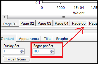
Phoenix has a maximum limit of 100 page tabs per plot display panel. This is only a limit on the number displayed, all plots are created, and, if an export is requested, all plots are exported. If a dataset contains more than 100 profiles mapped to a lattice condition, then plots 101 to 200 are contained in the second display set, etc. The Plot Content tab provides controls for switching between display panels (i.e., display sets) and for adjusting the number of tabs available at one time in a display panel.
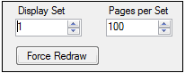
In the Display Set box, single-click the up and down arrows to view switch to a different set of page tabs (i.e., a different display set).
In the Pages per Set box, select or type the number of plot page tabs per display set.
The default and maximum number of page tabs per display set is 100.
Change the Pages per Set value to display less page tabs in the plot display panel.
Click the Force Redraw button to apply any changes made to the settings on this tab. (Clicking in another field or pressing the Enter key after changing the value in a field also triggers a redraw.)
The example below uses the default settings for the Content tab. The first 100 pages of the latticed results are available in Display Set 1.
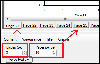
The figure below shows that the third display set has been selected for display and that the number of pages per set has been lowered to 10. Pages 21 through 30 are available when Display Set 3 is selected.
Set plot background and border
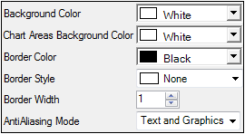
Select Plot > Layout in the tree, then click the Appearance tab.
Plot Options — Appearance tab
In the Background Color menu, select the background color used in the plot display panel by selecting a color scheme tab: Palette, Named, or System and clicking the color.
In the Chart Areas Background Color menu, select the background color used as the background for each plot by selecting a color scheme tab: Palette, Named, or System and clicking the color
In the Border Color menu, select the background color used in the plot display panel by selecting a color scheme tab: Palette, Named, or System and clicking the color.
In the Border Style menu, select the border style to display around each graph.
In the Border Width field, select or type the width for the plot borders. Users can select up to a 20 point border width.
In the AntiAliasing Mode menu, select the part of the plot to be smoothed through anti-aliasing.
Anti-aliasing options include:
None (default)
Text: smooth the lines in text only
Graphics: smooth the lines in the graphs only
Text and Graphics: smooth all lines (text and graphs)
Note that anti-aliasing can slow down performance.
Select Plot > Layout in the tree, then click the Title tab.
The Title menu item displays the title text field to enter a title for the plot. The tab also contains traditional Windows text formatting tools for defining the appearance of the title.
In the Text field, type a title.
Use the formatting controls above the Text field to modify the title’s appearance.
Select Plot > Layout in the tree, then click Graphs tab.
Plot Options — Graphs tab
Not all plot objects support adding multiple graphs to one plot object. If a plot object supports this feature, the Graphs tab instructions are included in that plot’s section.
Note:Users cannot add additional plots to Box, Histogram, or QQ plot objects, so the Graphs tab controls are unavailable for those plots.
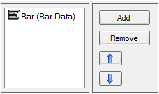
Click Add to add another plot to the Plot object. An additional plot is added to the plot list in the Graphs tab and an additional plot input is added to the Setup tab list.
Map a dataset to the additional plot object using the same steps listed under “Data Mappings panel”.
Remove a plot by selecting a plot in the plot list in the Graphs tab and clicking Remove.
Change the order of the plots by selecting a plot in the plot list in the Graphs tab and clicking the up or down arrow buttons.
Note:Plots are given a default name based on the variables mapped to the X, Y, and Y2 contexts.
Select Plot > Layout in the tree.
Refer to “Terminology of a plot display” for a review of the various areas that make up a plot.
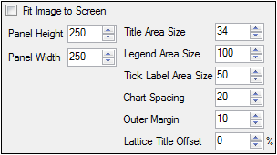
Select the Fit image to screen checkbox to force the plot image to fit the current size of the right viewing panel.
Note:Selecting Fit image to screen disables all other options in the Layout tab.
In the Panel Height field, select or type the number of pixels used to specify the plot height.
In the Panel Width field, select or type the number of pixels used to specify the plot width.
If a value is entered that is larger than what can be used in the plot display panel, then Phoenix automatically changes the value to maximum possible. Selecting more pixels than can be used to create the plot automatically changes the title, legend, axis and tick label space, chart spacing, and margin values.
In the Title Area Size field select or type the number of pixels used for the title area of the plots. Setting the value too low can cause the title to get cropped.
In the Legend Area Size field select or type the number of pixels used for the legend area. The Scatter Plot Matrix object does not use the Legend Area Size control.
In the Tick Label Area Size field select or type the number of pixels used for the tick labels.
In the Chart Spacing field select or type the number of pixels used to specify the distances between plots.
In the Outer Margin field select or type the number of pixels used to specify the margin around the plots.
In the Lattice Title Offset field select or type the number of pixels used to offset the lattice title from the plots.
Select Plot > Lattice in the tree.
The default lattice setting for a plot with a study variable mapped to one of the lattice conditions is Bind Lattice to Data. This setting automatically displays multiple plots per page (maximum is 15 by 15 plots per page). If a variable with more than 225 values is mapped to any lattice condition, Phoenix cannot automatically create the graph and lattice options must be set manually.
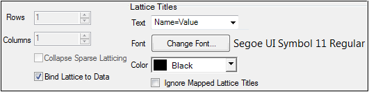
Clear the Bind Lattice to Data checkbox to specify lattice display options.
In the Lattice Rows box, select or type the number of rows used to lattice the plot.
In the Lattice Columns box, select or type the number of columns used to lattice the plot.
Select the Collapse Sparse Latticing checkbox to remove empty plots.
If multiple variables are mapped to lattice conditions and one variable does not contain as many data points as the others, some empty plots are created. Complete plots are only created when all variables mapped to lattice conditions contain the same number of values. Selecting the Collapse Sparse Latticing checkbox removes the empty plots.
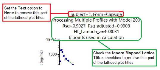
The Text menu controls the part of the plot title that comes from the data on which the lattice depends (e.g., the variable mapped to the Lattice Condition). Select the format for displaying this information in the title of each latticed plot. Options include:
Name: displays the name of the mapped variable.
Value: displays the value of the mapped variable.
Name - Value: displays the name and value of the mapped variable.
None: no information about the mapped variable is included in the title.
Controlling the content of latticed plot titles
Click the Change Font button to open the Font dialog and change the lattice title font.
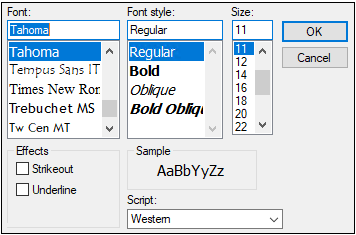
Select the font type, style, size, effect, and script. Click OK to accept the changes or Cancel to leave the font the same.
In the Color menu, select the lattice title color by selecting a color scheme tab: Palette, Named, or System and clicking the color.
Check the Ignore Mapped Lattice Titles box to hide the portion of the latticed plot titles derived from the worksheet being plotted.
