Phoenix includes several plot objects. These can be used to create plots using imported datasets, or output data from an analysis. Users can choose from:
Bar Plot object: To display the numeric values of categorical data. The data values of each series are represented as horizontal bars, which are plotted along the vertical axis at equally spaced intervals.
Column Plot object: To display the numeric values of categorical data. The data values of each series are represented as vertical columns, which are plotted along the horizontal axis at equally spaced intervals. Error bars can be added when no Groups are used.
Box Plot object: To graphically represent groups of numerical data through their five-number summaries, which include the smallest observation, the lower quartile (Q1), the median (Q2), the upper quartile (Q3), and the largest observation.
Histogram object: To create a graphical display of a frequency distribution. Bars are used to show a count of the data points that fall into various ranges.
XY Plot object: To create scatter or line plots. It can also be used to create overlaid plots. Regression lines and error bars can be added to XY plots.
QQ (quantile-quantile) Plot object: To display the quantiles of numeric data along with a comparison distribution which is the Standard Normal, to determine how closely the data fits the normal distribution. A quantile is the percent of data points below a given value.
Scatter Plot Matrix object: To shows a correlation between two or more variables. The Scatter Plot Matrix object contains all the pair-wise scatter plots of the variables on a single page in a matrix format.
X-Categorical XY Plot object: To create scatter plots when X is discrete data. It can also be used to create overlaid plots. Profile data, the independent variable, and the dependent variables can also be mapped to the Grouping context. For example, if time data is mapped to the X context, it can also be mapped to the Group context. If the time data is also mapped to the Group context, and concentration data is mapped to the Y context, then the plot displays the time and concentration data points using different markers for the data points.
Use one of the following to add the object to a Workflow:
Right-click menu for a Workflow object: New > Plotting > [plot object name].
Or Main menu: Insert > Plotting > [plot object name].
Or right-click menu for a worksheet: Send To > Plotting > [plot object name].
Note:To view the object in its own window, select it in the Object Browser and double-click it or press ENTER. All instructions for setting up and execution are the same whether the object is viewed in its own window or in Phoenix view.
Additional information is available on the following topics:
Terminology of a plot display
Plots user interface
Plotting results
Error bars and overlaying plots example
Before describing the individual controls, it will be helpful to understand the terminology used when discussing the areas of a plot displayed in the Phoenix user interface.
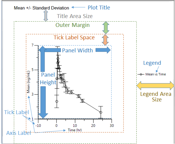
Anatomy of a Phoenix plot
-
The center of the display is the actual plot or graph, itself. This includes the plotted data points, any regression lines or error bars, and the axes lines. Adjusting the panel height and width options will change the size of this area.
-
The area that encompasses the tick marks, tick labels, and labels for the axes is called the axis and tick label space.
-
The outer margin area extends beyond the axis and tick label space area and provides white space around the plot.
-
The legend area is where the plot’s legend is displayed, if specified.
-
The space between the area where the plot’s title is displayed and the outer margin area is referred to as the title area size.
-
The area between the individual plots that make up a lattice is called chart spacing. For non-latticed plots, it is the area around the plot.
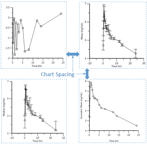
Chart Spacing is the white space between plots in a lattice
Adjusting the sizes of these areas is available in the Options tab below the display area, select the Layout under the Plot node. There are also controls for setting the appearance of different labels used in a plot. If you find a particular set of values that you would like to use as the default settings, they can be entered in the Plotting Defaults page of the Preferences dialog (Edit > Preferences). See “Plotting defaults” for more details.
