Error bars and overlaying plots example
The first part of this example uses summary statistics and error bars to create two XY plots, one using relative error bars and the other using absolute error bars. Next, plot overlays are created to help with data comparison.
Most Phoenix objects require the same basic steps for their use. However, there may be multiple paths to accomplishing a step (e.g., main menu, right-click menu, drag-and-drop, etc.). For simplicity, only one is listed here.
Note:Any object added to a project can be viewed in its own window by selecting the object in the Object Browser and double-clicking it or pressing ENTER. All instructions for setting up and executing an object are the same whether the object is viewed in its own window or in Phoenix’s viewing.
The completed project (Plots.phxproj) is available for reference in …\Examples\Data and Plots.
Set up the project
-
Create a new project called Plots.
-
Import the file …\Examples\WinNonlin\Supporting files\Bguide2.dat.
Click Finish in the Import File Wizard.
Units must be added to the time and concentration columns before the dataset can be used to create plots. -
In the Columns tab, below the displayed Bguide2 worksheet, select the Time column header in the Columns box.
-
Clear the Unit field and type hr.
-
Select the Conc column header in the Columns box.
-
Clear the Unit field and type ng/mL.
Or click the Units Builder button and use the Units Builder dialog tools.
Note:Units added to ASCII datasets can be preserved when the datasets are exported to disk or a database. Phoenix adds the units to a row beneath the column headers. When importing a .dat or .csv file with units, select the Has units row option in the Options area in the File Import Wizard dialog.
Set up the Descriptive Statistics object
To create error data for the error bars, this example computes means and standard deviations for the concentration data at each time point.
-
Right-click Bguide2 in the Data folder and select Send To > Computation Tools > Descriptive Statistics.
-
Map the data types as follows:
Sex mapped to None.
Subject mapped to None.
Time to the Sort context.
Conc to the Summary context. -
In the Options tab, check the Confidence Intervals and Number of SD Statistics checkboxes, but do not change the default values for these two items.
-
Click
 (Execute icon) to execute the object.
Plot the mean +/- standard deviation using relative error bars
-
Right-click the Statistics worksheet in the Results tab and select Send To > Plotting > XY Plot.
-
Map the data types to the following contexts:
Time to the X context.
Mean to the Y context.
SD to the Lower and Upper Error Bars.
Leave all other data types mapped to None. -
In the Options tab, click the Title sub-tab and type: Mean +/- Standard Deviation in the Title field.
-
Select Graphs > Mean vs Time > Error Bars in the Options tab list.
User is the default Error Calculation Type and Relative is the default User Calculation Type. Do not change these settings. Using the Relative User Calculation Type causes Phoenix to add and subtract the errors from the mean. -
Execute the object.
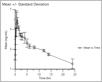
Plot the median, minimum, and maximum using absolute error bars
-
Right-click Workflow in the Object Browser and select the New > Plotting > XY Plot menu item.
-
In the XY Plot 1 XY Data Mappings panel click the Select Source icon to open the Select Source dialog.
-
Select the Descriptive Statistics object’s Statistics worksheet and click OK.
-
Map the data types as follows:
Time to the X context.
Median to the Y context.
Min to the Lower Error Bar.
Max to the Upper Error Bar.
Leave all other data types mapped to None. -
In the Options tab, click the Title sub-tab and type: Minimum, Median, and Maximum Concentrations.
-
Select Graphs > Median vs Time > Error Bars.
-
In the User Calculation Type menu select Absolute.
Using the Absolute User Calculation Type instructs Phoenix to plot the Min and Max values on the Y axis, rather than to add and subtract them from the Median. -
Execute the object.
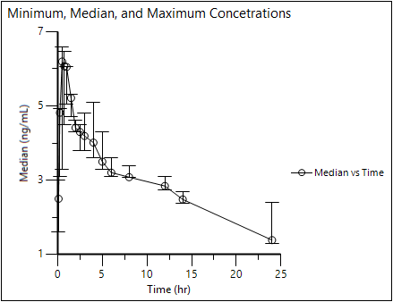
Overlay multiple plots using variables from the same dataset
This example overlays data from separate columns in the same workbook.
-
Right-click Workflow in the Object Browser and select New > Plotting > XY Plot.
-
In the XY Plot 2 XY Data Mappings panel click the Select Source icon.
-
Select the Descriptive Statistic’s Statistics worksheet and click OK.
-
Map the data types as follows:
Map Time to the X context.
CI 95% Lower Mean to the Y context.
CI 95% Upper Mean to the Y2 context.
Leave all other data types mapped to None. -
In the Options tab, click the Title sub-tab and type: Overlay Charts. Press ENTER to move to the next line and type: Example 1.
-
Select Plot > Layout.
-
Set the Legend Area Size field to 200.
-
Select Axes > Y and then the Axis Label sub-tab.
-
In the field type Confidence Interval and click
 to center the text.
 -
Execute the object.
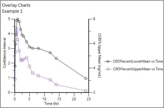
Overlaid charts
Note:If the data are stored in one column, it is also possible to create similar plots, without using the overlay feature, by assigning a variable or parameter to the Group context.
Overlay variables from multiple datasets
This part of the example plots the Observed and Predicted concentrations from a model fitting by using the exported output files from a PK Model object in a different project.
-
Import …\Examples\Data and Plots\Supporting files\bg1 Sheet1.dat and Summary Table.dat.
Click the Next Arrow button and then click Finish in the File Import Wizard dialog. -
Right-click bg1 Sheet1 in the Data folder and select Send To > Plotting > XY Plot.
-
Map the data types as follows:
Subject mapped to None.
Time to the X context.
Conc to the Y context. -
Select the Graphs tab.
-
Click Add.
-
Select XY 1 Data in the Setup list.
-
In the Data Mappings panel click
 (Select Source icon).
 -
In the dialog, select Summary Table worksheet and click OK.
-
Use the option buttons in the XY 1 Data Mappings panel to map the data types to the following contexts:
Map Time to the X context.
Map Predicted to the Y context.
Leave all other data types mapped to None. -
In the Options tab, click the Title sub-tab and type: Overlay Charts 2.
Press ENTER to move to the next line and type: Example using two datasets. -
Select Graphs > Conc vs Time.
-
Select the Appearance tab.
-
Use the Marker Color menu to change the marker color to Red.
-
Execute the object.
-
Right-click the project and select Close Project.
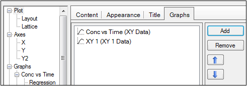
A second XY Plot input named XY 1 Data is added to the Setup list.
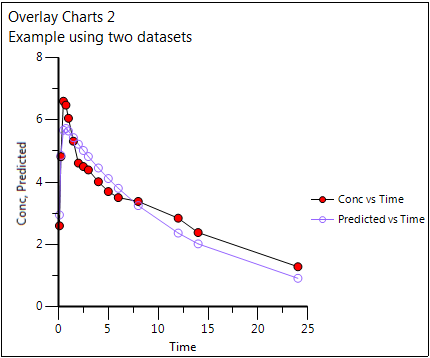
Chart of overlaid datasets.
This concludes the Error Bars and Overlaying Plots example.
