AutoPilot Toolkit supports automation of PK analyses through the use of the NCA model object’s output. The PK Automation settings in the user interface can be saved as a Phoenix project or template file for re-use. The PK analyses supported by AutoPilot Toolkit can also be retrieved as scenarios from the PKS.
Use one of the following to add a PK Automation object to a Workflow:
Right-click menu for a Workflow object: New > AutoPilot > AP Automation.
Or Main menu: Insert > AutoPilot > AP Automation.
Or right-click menu for a worksheet: Send To > AutoPilot > AP Automation.
An AP Automation object must have a source of input data assigned to it as a first step. When the input source is selected, AutoPilot Toolkit then creates the AP Automation user interface based on the input data.
Usually the Final Parameters table from an NCA model is mapped to the AP Automation object. In a trough automation project, on the other hand, the Observations dataset is used. Datasets from different operational objects can also be mapped to a trough automation project. For example, a worksheet that is created by the Column Transformation or Bioequivalence objects can be mapped to an AP Automation object as long as the worksheet contains valid data for trough automation.
When connected to an NCA object, the AP Automation object detects any changes to the NCA model and generates an alert. The AP Automation object does not correct the problem. It only alerts users that changes were detected in Sort Keys, Model Types, Dose Types, or Sparse settings. Users must revert their NCA changes or make the necessary changes to the AP Automation object. The Automation object will be marked as “out of date” if changes to the NCA model are detected or if the NCA model input data is changed. In the latter case, the NCA model will also be marked as “out of date.”
Note:The reference treatment must exist in both the study worksheet and in the NCA model output in order for the PK Ratios and PK Statistics tables to be created. If the reference treatment does not exist in the NCA model output (due to less than two time points or invalid concentration values), then the two tables cannot be created and an error is displayed.
To change a source of input data
Once a source of input data is mapped to an Automation object, it can be changed by simply remapping the input to the new source. AutoPilot Toolkit will check the compatibility of the new source with the object.
-
If the new source appears to be compatible with the object, a message to this effect is presented in a dialog along with a reminder to review the object’s settings.
-
If the new source is incompatible with the object (e.g., the object, initially connected to a plasma NCA model is remapped to a urine model), a warning is generated. Continuing with mapping of the incompatible data source to the object will result in all settings and/or previous results being cleared.
This section contains the following topics:
•List of output typesInput panel
•Stratification/Normalization tab
See also:
•“PK Automation tables” lists tables available for each combination of study design, dosing, regimen, and matrix.
•“PK Automation graphs” lists graphs available for each combination of study design, dosing, and matrix.
•“PK Automation appendix output” lists appendices available for each study design.
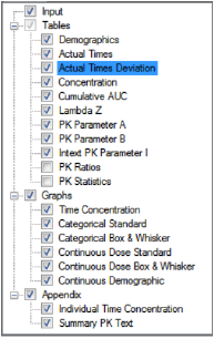
The Setup tab consists of two areas, a hierarchical listing consisting primarily of output types available for the AP Automation object selected in the Object Browser, and a panel area for displaying options specific to an item selected in the hierarchical list.
-
Check/clear the checkbox beside a table type to include/exclude the table in the output.
-
Check/clear the checkbox beside the main Tables, Graphs, or Appendix items to add/remove all items under that heading from the output.
Note:Be sure to uncheck the Continuous Demographic graph if the study does not contain continuous demographic variables.
Selecting Tables in the hierarchical list is only possible when stratifications or exclusions are set, or when the input data is stacked by analyte.
-
To set options for an output type, click the name of the output type in the hierarchical list and make changes to the options displayed in the panel on the right.
When an AP Automation object is inserted into a project, the input source must be assigned before the object can be used or modifications to object settings can be made. The input source can be mapped to an NCA Final Parameters worksheet or observations dataset.
Note:The units specified in a data set and in the NCA Model Options > Units tab must match in order for the output to make sense.
-
In the Setup tab, select Input in the hierarchical list.
Or
In the Diagram tab, right-click an AP Automation object and select View Setup.
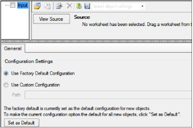
In the previous figure, no input source has been defined, so the options available are restricted to selecting the source and specifying an alternative source for configuration settings (refer to “General tab” for more information on configuration settings).
Users can set the variables, statistics, or precision for each table type. The options available depend on the type of table selected.
The following sections describe the table options available:
•Variables and Statistics tabs
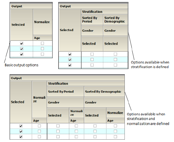
The main Tables panel is only available if the input source is stacked by analyte, or when stratifications or exclusions are set, and at least one individual table’s checkbox must be checked. The panel shows options that can be applied when generating the tables. The options vary depending on whether the source is stacked or if stratifications and/or exclusions are defined.
-
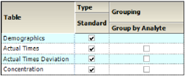
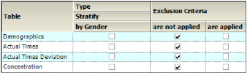
In the Setup tab, select Tables in the hierarchical list.
-
Check/Uncheck the Standard box to include/exclude a table in the output.
-
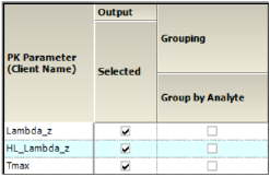
Check the Group by Analyte box to group the data for each analyte as separate columns within the same table. Uncheck the box to create separate tables for each analyte.
Grouping is not available for the Demographics table.
-
When stratification schemes have been defined, they can be applied by checking the Stratify by ___ box. Uncheck the box to generate only a standard table.
Note:At least one stratified table must be selected if stratifications are specified or the object will not pass verification.
-
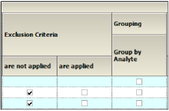
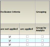
When Exclusion Criteria are defined, they can be applied when generating a table by checking the corresponding are applied box. Check the are not applied box to generate a table, ignoring the exclusion criteria.
See also:
•Stratification/Normalization tab
•Output Options tab for defining exclusions.
The Variables and Statistics tabs are formatted the same for most tables. See “PK Parameters” for a full list and descriptions of supported PK parameter study variables. See “Summary Statistics” for a full list and descriptions of supported statistics.
Note:The Variables tab may/may not be available, depending on the table type.
-
In the Setup tab, select a table type in the hierarchical list.
-
Select the Variables or the Statistics tab.
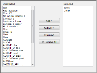
Variables and statistics that are in the Selected column will be included in the output and will be reported in the order that they appear in the column.
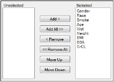
The following instructions apply to both the Variables tab and the Statistics tab.
-
Select an item in one of the columns.
-
Click Add or Remove to move the item from one column to another.
-
Click Add All and Remove All to move all variables from one column to another.
-
Click Move Up and Move Down to change the position of a selected item in the list.
Note:Selecting a large number of PK Parameters for statistics can generate a table that will not fit on a single page and the table-splitting option does not currently work for the PK Stats table. Choose only 7 or 8 parameters for this table. If you require more parameters to be listed, perform additional Automation runs for the additional desired parameters and generate only the PK Stats table
When PK Statistics are specified, the AutoPilot Toolkit object should be executed directly and not as part of the Phoenix workflow or the PK Stats table creation may fail.
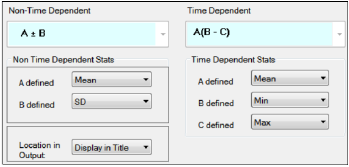
The Statistics tab for Intext PK Parameter tables contains different options than Statistics tabs for other tables.
-
In the Setup tab for an Intext PK Parameter type table, select the Statistics tab.
-
In the Non-Time Dependent section, select the equation to be used (currently A +/- B is the only one available).
-
Identify the statistics to use in the equations from the pull-down menus.
-
Choose the location for displaying the information: Display in Title, Display in Footnote, Do not display in output.
-
In the Time Dependent section, select the equation to be used (currently A(B – C) is the only one available).
-
Identify the statistics to use in the equations from the pull-down menus.
Note:Changes made to the non-time dependent and time dependent statistics options in one Intext table are copied to the other Intext table. For example, if Comparison Intext PK Parameter II Analyte is selected in the Tables tab and the settings for A and B in the Non-Time Dependent Stats area are changed, the changes are automatically applied to the Comparison Intext PK Parameter I Analyte table.
This tab becomes available for PK Parameter tables when normalization schemes are defined (see “Stratification/Normalization tab”).
-
In the Setup tab for a table of PK parameters, select the Standard/Normalize tab.
-
Select the Display option All standard, then all normalized by ____ to list all of the standard columns first, followed by normalized columns.
-
To group the columns so that the standard and normalized version of the data are together, select the Display option Group together standard and normalized by ____.
-
Toggle generation of tables with and/or without normalization for each parameter by selecting/unselecting the checkboxes in the Normalize and Standard columns.
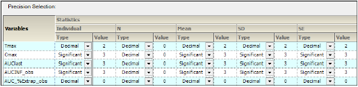
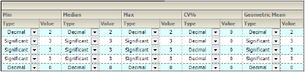
For each variable and statistic, the precision can be set by the number of significant digits or decimal places. Selection of the type and value of numerical precision is also done through this tab.
-
In the Setup tab, select a table type from the hierarchical list and select the Precision tab.
-
In the Type menu for each statistic, select Decimal or Significant.
-
Select a cell in the corresponding Value column to enter a new precision display value.
An option is available for PK Ratios and PK Statistics tables to include inferential statistics calculations and PK parameter ratios in order to produce additional output tables titled PK_Ratios and PK_Statistics. See “PK Automation tables” for descriptions of the tables.
-
In the Setup tab, select PK Ratios or PK Statistics in the hierarchical list.
-
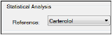
In the Reference menu, select an analyte to include in the statistical analysis.
The Reference can be selected in the PK Ratios and PK Statistics panels. The specified reference treatment will be used as the denominator in the ratio and inferential statistics calculations.
AutoPilot Toolkit allows the user to apply different attributes to each graph. These attributes include Y-axis scaling, summary value display, error bar display, and regression line options. Selection of PK parameters to include in the graphs is also available.
The following sections describe the graph options available for each graph type:
•Categorical Box and Whisker panel
•Continuous Dose Standard panel
•Continuous Dose Box and Whisker panel
-
In the Setup tab, select Graphs in the hierarchical list.
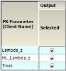
Parameters that are in the Selected column will be included in the output.
-
Select an item in one of the columns.
-
Click Add or Remove to move the item from one column to another.
-
Click Add All and Remove All to move all variables from one column to another.
-
In the Setup tab, select Time Concentration in the hierarchical list.
There are three types of Table Concentration graphs available:
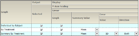
•Individual by Subject: A separate graph is generated for each subject involved in the study. Each line on the graph represents a separate treatment.
•By Treatment: A separate graph is generated for each treatment performed during the study. Each line in the graph represents a separate subject. An additional Summary Value line may also be present.
•Summary by Treatment: A single graph is generated. Each line represents a separate treatment.
The panel displays a table of options for the Time Concentration graphs, grouped into categories and sub-categories:
Output
-
Check/Uncheck the Selected box to include/exclude a type of Time Concentration graph in the output.
-
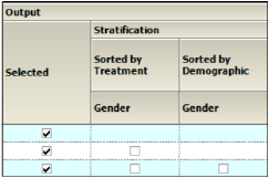
When Stratification schemes are defined (see “Stratification/Normalization tab”), they can be used either as X-axis variables in a By Treatment or Summary by Treatment graph type (Sorted by Treatment) or new sort variables in a Summary by Treatment graph type (Sorted by Demographic). Use the checkboxes to indicate the sorting mechanism(s) for each stratification scheme.
Display
-
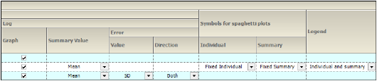
Graphs can be generated using a Linear or Log Y-Axis Scaling. The following options are available for both types of scaling:
•Check/Uncheck the Graph box to use/not use the Y-axis scaling method. Checking boxes for both Linear and Log will generate two graphs, one using each method.
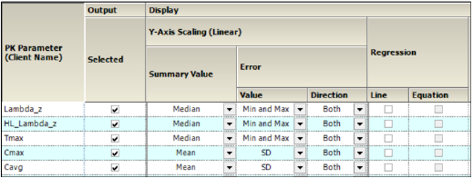
•Available for By Treatment and Summary by Treatment types, select the statistic to use as the Summary Value when plotting the summary line: Mean, Median, Geometric Mean, Harmonic Mean, None.
•Specify the Value (SD, SE, Variance, Min and Max, None, 68% Range) and Direction (Both, Down, Up) of error bars to display on Summary by Treatment graphs.
-
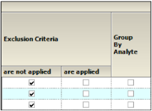
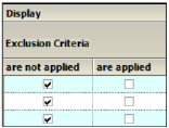
When Exclusion Criteria are defined (see “Output Options tab”) they can be applied when generating a graph by checking the corresponding are applied box. To ignore the exclusion criteria when generating the graph, check the are not applied box.

-
When an input dataset is stacked by analyte, check the Group by Analyte box under Grouping to group the data by analyte within the same graph. Uncheck the box to generate separate graphs for each analyte.
-
Symbols for spaghetti plots
•Individual: Specify the symbol to use when plotting individual subject data points on a By Treatment graph. Fixed Individual uses the same symbol for all the individual subject data, Variable Individual uses a different symbol for each individual subject’s data, None shows only the resulting line.
•Summary: Specify the symbol to use when plotting the summarized data on a By Treatment graph. Fixed Summary displays the summary points on the graph using a symbol. None shows only the resulting line.
-
Specify the information to display in a Legend for By Treatment graphs.
•None: Do not display a legend.
•Individual and Summary: Include the symbol for individual subject data points and the symbol for summary points.
•Summary Only: Include only the symbol for summary points.
-
In the Setup tab, select Categorical Standard in the hierarchical list.

The PK Parameters available in the study are listed as rows in the table.
The panel displays a table of options for the Categorical Standard graphs, grouped into categories and sub-categories:
Output
-
Check/Uncheck the Selected box to include/exclude a parameter when generating graphs.
•If normalization schemes are also defined (see “Stratification/Normalization tab”), check/uncheck the Normalize subcategory boxes to normalize/not normalize the graphs.
-
When Stratification schemes are defined (see “Stratification/Normalization tab”), they can be used either as X-axis variables (Sorted by Treatment or Sorted by Period for replicated studies) or new sort variables (Sorted by Demographic). Check/Uncheck the Selected boxes to indicate the sorting mechanism(s) for each stratification scheme.
•If normalization schemes are also defined, check/uncheck the Normalize subcategory boxes to normalize/not normalize the stratified graphs.
Display
The graphs are generated with a Linear scaled Y-axis.
-
Select the statistic to use as the Summary Value when plotting the summary line: Mean, Median, Geometric Mean, Harmonic Mean, None.
-
Specify the Value (Min and Max, Pseudo SD, SD, SE, Variance, 68% Range) of the Error bars. The only option available for Direction is Both.
-
When Exclusion Criteria are defined (see “Output Options tab”) they can be applied when generating a graph by checking the corresponding are applied box. To ignore the exclusion criteria when generating the graph, check the are not applied box.

-
When an input dataset is stacked by analyte, check the Group by Analyte box under Grouping to group the data by analyte within the same graph. Uncheck the box to generate separate graphs for each analyte.
Categorical Box and Whisker panel
Note:There must be at least three subjects in the study to create Box and Whisker graphs.
-
In the Setup tab, select Categorical Box & Whisker in the hierarchical list.
The PK Parameters available in the study are listed as rows in the table.
Output
-
Check/Uncheck the Selected box to include/exclude a parameter when generating graphs.
•If normalization schemes are also defined (see “Stratification/Normalization tab”), check/uncheck the Normalize subcategory boxes to normalize/not normalize the graphs.

-
When Stratification schemes have been defined (see “Stratification/Normalization tab”), they can be used either as X-axis variables (Sorted by Treatment or Sorted by Period for replicated studies) or new sort variables (Sorted by Demographic). Use the checkboxes to indicate the sorting mechanism(s) for each stratification scheme.
•If normalization schemes are also defined, check/uncheck the Normalize subcategory boxes to normalize/not normalize the graphs.
Display
-
When Exclusion Criteria have been defined (see “Output Options tab”), they can be applied when generating a graph by selecting the corresponding are applied checkbox. Select the are not applied checkbox to generate a graph, ignoring the exclusion criteria.
-
When an input dataset is stacked by analyte, the data can be grouped by analyte within the same graph by checking the Group by Analyte box below Grouping. Unselect the checkbox to generate separate graphs for each analyte.
Continuous Dose Standard panel
-
In the Setup tab, select Continuous Dose Standard in the hierarchical list.
The PK Parameters available in the study are listed as rows in the table.
The panel displays a table of options for the Continuous Dose Standard graphs, grouped into several categories and sub-categories:
Output
-
Check/Uncheck the Selected box to include/exclude a parameter when generating graphs.
•If normalization schemes are also defined (see “Stratification/Normalization tab”), check/uncheck the Normalize subcategory boxes to normalize/not normalize the graphs.

-
When Stratification schemes have been defined (see “Stratification/Normalization tab”), they can be used either as X-axis variables (Sorted by Treatment) or new sort variables (Sorted by Demographic). Use the checkboxes to indicate the sorting mechanism(s) for each stratification scheme.
•If normalization schemes are also defined, check/uncheck the Normalize subcategory boxes to normalize/not normalize the graphs.
Display
-
Graphs are generated with a Linear Y-Axis Scaling.
•Select the statistic to use as the Summary Value when plotting the summary line: Mean, Median, Geometric Mean, Harmonic Mean, None.
•Specify the Value (Min and Max, Pseudo SD, SD, SE, Variance, 68% Range) of the Error bars. The only option available for Direction is Both.
-
For Regression, check the Line checkbox to include a regression line in the graph. Check the Equation box to display the regression equation in the graph.
-
When Exclusion Criteria have been defined (see “Output Options tab”), they can be applied when generating a graph by selecting the corresponding are applied checkbox. Select the are not applied checkbox to generate a graph, ignoring the exclusion criteria.
-
The Group by Analyte category appears when an input dataset is stacked by analyte. Check the box to group the data by analyte within the same graph. Uncheck the box to generate separate graphs for each analyte.
Continuous Dose Box and Whisker panel
Note:There must be at least three subjects in the study to create Box and Whisker graphs.
-
In the Setup tab, select Continuous Dose Box and Whisker in the hierarchical list.
The PK Parameters available in the study are listed as rows in the table.
Output
-
Check/Uncheck the Selected box to include/exclude a parameter when generating graphs.
•If normalization schemes are also defined (see “Stratification/Normalization tab”), check/uncheck the Normalize subcategory boxes to normalize/not normalize the graphs.

-
When Stratification schemes have been defined (see “Stratification/Normalization tab”). Select the checkbox to stratify the graph data.
•If normalization schemes are also defined, check/uncheck the Normalize subcategory boxes to normalize/not normalize the graphs.
Display
-
When Exclusion Criteria have been defined (see “Output Options tab”), they can be applied when generating a graph by selecting the corresponding are applied checkbox. Select the are not applied checkbox to generate a graph, ignoring the exclusion criteria.
-
In the Setup tab, select Continuous Demographic in the hierarchical list.
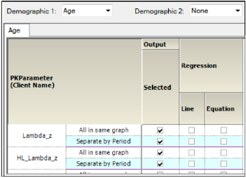
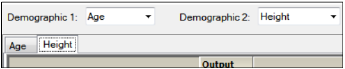
The panel displays a section for selecting up to two demographic(s) to use for the X-axis (Demographic 1 and Demographic 2).
When a second demographic type is selected, a second tab is created in the Continuous Demographic panel.
The PK Parameters available in the study are listed as rows in the table. For each parameter, there are two sub-rows:
-
All in Same Graph: Include all treatments in the same graph.
-
Separate by Treatment: Create a separate graph for each treatment.
The lower part of the panel contains a table of options for the Continuous Demographic graphs, grouped into several categories and sub-categories:
Output
-
Check the Selected box to create a single graph for the parameter showing all the treatments or to create a separate graph for the parameter for each treatment performed. Uncheck the box to not generate the graph(s) for a parameter.
•If normalization schemes are also defined (see “Stratification/Normalization tab”), check/uncheck the Normalize subcategory boxes to normalize/not normalize the graphs.
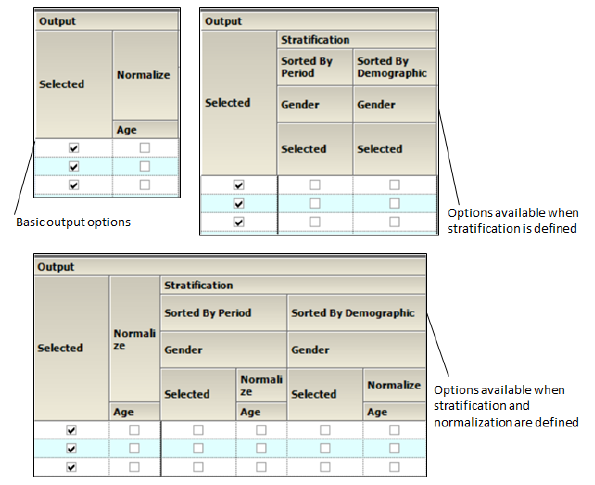
-
When Stratification schemes have been defined (see “Stratification/Normalization tab”), they can be used either as X-axis variables (Sorted by Treatment or Sorted by Period for replicated studies) or new sort variables (Sorted by Demographic). Use the checkboxes to indicate the sorting mechanism(s) for each stratification scheme.
•If normalization schemes are also defined, check/uncheck the Normalize subcategory boxes to normalize/not normalize the graphs.
Display
-
Select the Line checkbox to include a Regression line in the graph. Select the Equation checkbox to display the regression equation in the graph.
-
When Exclusion Criteria have been defined (see “Output Options tab”), they can be applied when generating a graph by selecting the corresponding are applied checkbox. Select the are not applied checkbox to generate a graph, ignoring the exclusion criteria.
-
When an input dataset is stacked by analyte check the Group by Analyte box to group the data by analyte within the same graph. Uncheck the box to generate separate graphs for each analyte.
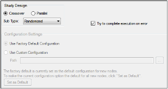
The General tab allows users to select the study design type, configuration settings, and whether or not to try to complete an automation run if an error occurs.
The study design options in the General tab depend on the configuration settings. If the settings are changed, then the options could be different from the options listed below.
Note:The configuration settings must be specified before a dataset is mapped to the AP Automation object.
Study Design
-
Specify that the study design type is either Crossover or Parallel.
-
For a Crossover study design, select the study SubType (Randomized, Non-Randomized, or Replicated).
-
By default, AutoPilot Toolkit tries to complete an automation run even if errors are encountered and not all selected output can be created.
-
Unselect the Try to complete execution on error checkbox to stop an automation run if any errors are encountered.
Configuration Settings
-
Indicate the configuration settings to use. Use Factory Default Configuration is selected by default.
-
To use customized settings, select Use Custom Configuration and click the Change Directory
 button to select the directory where the custom configuration settings file is located.
 -
The customized settings can be defined as the default configuration settings to use for new projects by clicking Set as Default.
Stratification/Normalization tab
The Stratification and Normalization options allow users to create additional table and/or graph output.
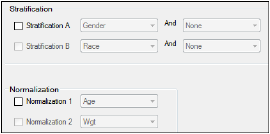
Stratification
Results can be stratified (i.e., layered) using discrete demographic variables. Each stratification level can use one or two discrete demographic variables. If two variables are specified, they are associated using the logical operator AND.
Note:At least one stratified output type must be selected if stratification is enabled or the Automation project will not pass verification.
-
To define the first level of stratification, select the Stratification A checkbox and choose the demographic variable(s) from the pull-down menu(s).
-
To define a second level of stratification, select the Stratification B checkbox and choose the variable(s) from the pull-down menu(s).
If stratifications are selected, the automation run creates one table per stratum for the time and concentration, PK parameter, and intext PK parameter tables, using the stratification scheme as an additional group variable.
If graphs include stratification, the stratification schemes are used either as X-axis variables (sorted by treatment) or new sort variables (sorted by demographics), depending on the AutoPilot Toolkit Admin settings.
Normalization
Use the Normalization section to define normalization schemes to apply to the results. Each normalization scheme must use a different continuous demographic variable.
-
To define the first level of normalization, select the Normalization 1 checkbox and choose a demographic variable from the pull-down menu.
-
To define a second level of normalization, select the Normalization 2 checkbox and choose a variable from the pull-down menu.
AutoPilot Toolkit calculates the normalized PK parameters and includes them in the results. Users can select the PK Parameter, Intext PK Parameter, PK Ratios, and PK Statistics tables in the hierarchical list and choose which normalized parameters to display in each table. This allows PK Parameter automation tables to include both normalized and non-normalized values.
-
Select the PK Parameter, Intext PK Parameter, PK Ratios, or PK Statistics table in the Tables node.
-
Select the Standard/Normalize tab.
-
In the Display menu, select how to display normalized PK parameters in the table output.
-
Select the Normalize checkbox beside a PK parameter to include it in the table output.
For more on using the table panels, see “Table panels”.
Column headers for the normalized variables include a normalization variable and its units. For example, oral clearance normalized by weight: CL/F/Weight (L/hr/kg). If graph output is selected that includes normalization, each normalized PK parameter is displayed in a separate graph. The Y-axis labels display the normalization in the same manner as tables.
PK parameters that are excluded from normalization are listed in “PK automation parameters”.
The Display tab contains four tabs that allow users to set output and display options, table and graph orientation, and the X- and Y-axes scaling for graphs.
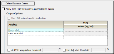
The Output Options tab allows users to define exclusions, the LOQ value, and the AUC percent extrapolation threshold value.
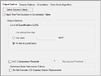
-
Click Define Exclusion Criteria to open the Excluded Profiles From Summary Statistics dialog. (See “Excluded profiles from summary statistics”.)
The options for LOQ vary depending on the type of data used and the system configuration settings.
-
Turn on the Apply Time Point Exclusion to Concentration Tables checkbox to exclude entire profiles based on the presence of values within the ExclusionFlag column in the input study data. The excluded profiles are still displayed in the results, but are excluded from calculation of summary statistics.
-
For unstacked data, choose one of the following methods of defining the LOQ:
•To set the LOQ value using the input data, click Use setting from data.
•To enter a value, click Use value and type a value in the corresponding field.
•Click No limit of quantification to not set an LOQ limit.
If the input dataset contains stacked data, a different LOQ can be set for each analyte.
-
For stacked input data, do one of the following to set the LOQ:
•Turn on the Use LOQ values found in study data checkbox to set the values for LOQ using the input data.
•Enter an LOQ value for each analyte in the Value column. (The concentration units are taken from the input dataset.)
•To not use LOQ values, turn off the Use LOQ values found in study data checkbox and leave the Value column entries blank.
Note:If the LOQ is set to a value that exceeds all concentration values, no Concentration graphs will be created.
Setting the LOQ value for all analyts can significantly extend the execution time.
For more information, see “LOQ replacement”.
The following option is applicable to both stacked or unstacked input data:
-
Turn on the AUC% Extrapolated Threshold checkbox to use the rules for handling AUC extrapolated values that exceed the specified percentage.
See “PK parameter percent-extrapolated threshold” for details.
-
Turn on the Rsq Adjusted Threshold checkbox to use the rules for handling Rsq Adjusted values that are lower than the specified value.
-
Turn on the Do Not Overwrite LOQ Summary Statistics Replacements to retain the LOQ summary statistics values.
Excluded profiles from summary statistics
-
Click Define Exclusion Criteria in the Output Options tab.
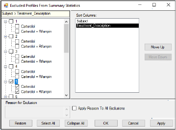
Every profile in the study data is displayed in the Profile list on the left of the dialog. Users can exclude complete or partial profiles. The variables used to create each profile are displayed in the Sort Columns list. Each profile contains a subject ID and one or more treatments. By default, each profile is listed by subject ID, and the treatment or treatments are listed beneath each subject.
-
Select the checkbox beside each subject ID to exclude the subject and any treatments given to the subject.
-
Select the checkbox beside a treatment listed beneath a subject ID to exclude that treatment from the profile.
-
To change the order of the profiles in the list, select a profile variable in the Sort Columns list and click Move Up or Move Down.
For example, if the treatment is moved to the top of the Sort Columns list, then the Profile list displays the treatment first and lists the subject IDs underneath the treatment.
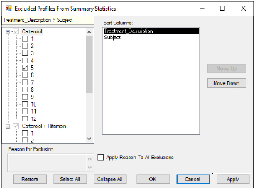
Sort Columns rearrange the order in which profiles are listed on the left
-
To enter a reason for exclusion:
•Select the item being excluded.
•Enter the information in the Reason for Exclusion area below the profile list.
•Turn on the Apply Reason To All Exclusions if the entered information is applicable to all items selected for exclusion in the profile list.
-
Use the Restore, Select All, and Collapse All buttons to restore the profile list to its original status when the dialog was initially displayed, to select all items in the profile list, or to collapse all items in the list, respectively.
The Display Options tab allows users to set table and graph output display options, select the time and concentration variables in the input dataset, and choose whether or not to include data source information.
-
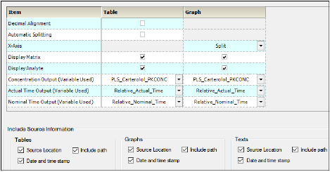
Turn on the Decimal alignment checkbox to align all values in a given column using their decimal points. See “Table data display using decimal alignment”.
-
Turn on the Automatic splitting checkbox to allow splitting large tables across multiple pages. See “Table business rules”. (Splitting long tables can result in borders being improperly formatted.)
-
Select from the X axis pull-down if the PK parameter graphs have a Split X-axis based on individual and summary values or Offset.
-
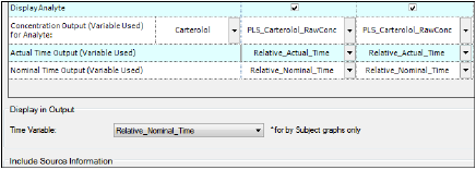
Turn on the Display Matrix or Display Analyte checkbox to include the matrix or analyte information in the tables and/or graphs. See “Display analyte and matrix information” (tables) or “Display analyte and matrix information” (graphs).
-
Select the concentration variable to use for creating time-concentration tables and graphs from the Concentration Output (Variable Used) pull-down menu.
For trough projects with unstacked input data, this option changes to Concentration Output (Variable Used) for Analyte. Use the first pull-down to select the analyte whose concentrations are to be reported and then continue with specifying the concentration variables for the tables and graphs.
-
Use the Actual and Nominal Time Output (Variable Used) pull-down menus to select which data column to use for the actual and nominal times. This is set using the Admin Module. See “Time Variables tab”.
-
The Display in Output section, available only for trough projects, contains a Time Variable pull-down menu. Select the actual or the nominal time variable to use in the Conc by Subject graphs, which display individual trough time and concentration for one subject per graph.
-
In the Include Source Information section, select or clear the checkboxes to include or exclude the location of the input file, the path to that location, and a date and time stamp in the Table, Graph, and Text output.
Through the Orientation tab, the orientation of each output item is set. A few additional settings regarding the appearance of graphs in a Word document are available for appendices involving individual time-concentration graphs.
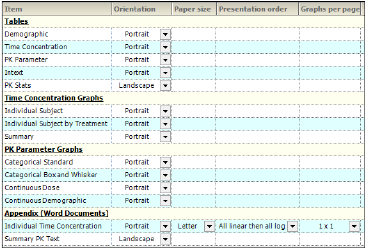
-
In the Orientation column, select whether to position the output as a Portrait or in Landscape format from the pull-down menu for each table, graph, and appendix output.
Note:Only certain tables and graphs can be changed to Landscape. If Landscape is not supported, the Orientation setting for that table or graph defaults to Portrait and the pull-down menu is disabled.
For the Individual Time Concentration appendix output type, the following specifications can also be made.
-
Select the Paper Size as Letter or A4 from the pull-down menu.
-
Indicate the order in which the graphs are to appear using the Presentation Order column pull-down menu. Options include:
•All linear then all log: Display the linear graphs (sorted by subject) before the log graphs (sorted by subject).
•All log then all linear: Display the log graphs (sorted by subject) before the linear graphs (sorted by subject).
•Per profile, linear then log: Graphs are grouped by subject and then by analyte, with the linear graph presented before the log graph. In the output, the graphs are displayed in subject order.
•Per profile, log then linear: Graphs are grouped by subject and then by analyte, with the log graph presented before the linear graph. In the output, the graphs are displayed in subject order.
-
Specify the number of graphs per page using the pull-down in the Graphs Per Page column. Options range from 1x1 up to 4x4.
The Time Scale Algorithm tab is used to specify the scaling options for the axes, the lower and upper bounds for time scale ticks, the tick frequency, the tick units, and the maximum time scale on the X-axis. See “Time scale algorithm” for more information.
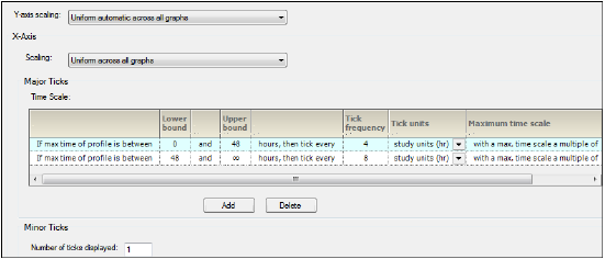
-
In the Y-axis scaling menu, choose whether to scale the Y-axis uniformly across all graphs or scale the Y-axis on a per graph basis.
-
In the X-Axis area, select X-axis Scaling to be either uniformly across all graphs or on a graph by graph basis.
The Major Ticks area contains a table where each row represents a separate time scale.
-
Enter new values for lower and upper bounds in the Lower bound and Upper bound fields.
Use the Tick frequency and Tick units columns together to define the frequency with which tick marks are displayed along the X-axis.
-
Enter the value directly in the Tick frequency field and then select the units from the Tick units pull-down menu. (The default is study units, indicating that the units are derived from the study data.)
-
Set new values for the time scale multiple value in the Maximum time scale multiple value field.
-
Click Add in the Major Ticks area to add another time scale.
A new row is added to the table below the row that was selected or modified last.
-
To remove an added time scale, click in that row and then click Delete.
A minimum of two defined time scales is required.
-
In the Minor Ticks area, change the number of minor ticks displayed between the major ticks by typing a new value in the Number of ticks displayed field.
The Ordering tab is used to specify how the treatment descriptions and demographic study variables are ordered in the output.
Treatments sub-tab
-
Select a treatment in the list and use the Move Up and Move Down buttons to rearrange its position in the display order.
Discrete Variables sub-tab
The Discrete Variables tab contains the tools to reorder the attributes of any variables used for stratification.
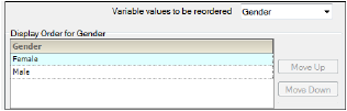
-
Use the Variable values to be reordered menu to select different discrete study variables.
-
Select the variable in the list and use the Move Up and Move Down buttons to rearrange its position in the display order.
Note: If the first treatment does not contain a stratification value then the order chosen in the Discrete Variables tab for the stratification is ignored in the graph output.
This tab is present only if the input data is stacked and lists all of the analytes involved in the study.
-
Select an analyte in the list and use the Move Up and Move Down buttons to rearrange its position in the display order.
Note:Concentration table output will not maintain the order specified in this tab.
Caution:Do not perform any operations on the computer while the automation run is in progress. Doing so could cause unpredictable results; keyboard and mouse input during an automation run might affect automated AutoPilot Toolkit operations.
After the project successfully completes, all output is arranged in groups in the Results tab.
Not all output can be viewed in Phoenix. In such cases, the right side of the Results tab will display a message with suggestions on how to view the results. One suggestion is to open an external program and load the results by clicking View in External Viewer.
The automation output can be individually exported to disk or copied to Phoenix’s Data folder. All results can be exported using the File Explorer, which is located in the Reporting tab. For more using the File Explorer, see “AutoPilot File Explorer”.
