The Time Scale algorithm, which is applicable to graphs with a continuous time-based X-axis (for example, time or midpoint), is enabled by default in the Admin Module. If it is disabled, graphs use SigmaPlot's internal algorithm for applying X- and Y-axis scales and for minor and major ticks. Administrators can both enable and configure the settings for this rule, and also choose whether to make the settings configurable by the user during automation and comparison runs.
Note:Any settings selected in the Admin Module can be overridden by the user if the Available to user checkbox is selected.
This rule has two parts:
•Force all graphs to have the same X-axis and/or Y-axis scales.
•Force graphs to have consistent ticks and labels for time-related x-variables.
Part 1: Force all graphs that have a continuous time-based X-axis (time, midpoint, etc.) to have the same X-axis scale and ticks and/or the same Y-axis scale and ticks. The following configurations are available:
-
Y-axis scaling (choose one option in the user interface):
•Uniform automatic across all graphs: Based on the maximum value of the dependent variable associated with all data points from the entire dataset. This option is the default.
•On a graph by graph basis: Based on the maximum value of the dependent variable associated with all data points for a given graph.
•Uniform for linear and on a graph by graph basis for log graphs: Combination of the first two options, the first is applied to linear graphs and the second to log graphs.
•On a graph by graph basis for linear and uniform for log graphs: Combination of the first two options, the first is applied to log graphs and the second to linear graphs.
-
X-axis scaling (choose one option in the user interface):
•Uniform across all graphs: Based on the maximum time point associated with all data points from the entire dataset. This option is the default.
•On a graph by graph basis: Based on the maximum time point associated with all data points for a given graph.
Part 2: Force all graphs that have a continuous time-based X-axis (time, midpoint, etc.) to have consistent ticks and labels for time-related x-variables.
The Major ticks time scale table in the Admin Module and user interface is shown in the screen shot below. If the maximum time point value in a dataset (or a subset of the dataset if the On a graph by graph basis option is selected) is within the range specified by the lower and upper bounds, that row in the table is used to establish the associated major tick frequency, tick units, and the maximum time scale. The range is always interpreted in hours regardless of the original dataset study units.
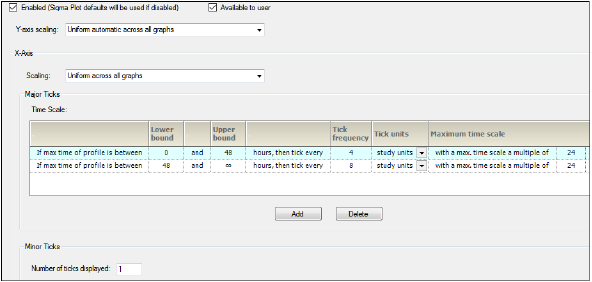
Time Scale Algorithm tab
For example, for a Concentration by Treatment graph, users might have two treatments, where the last observation of Trt A is at 24 hours and last observation of Trt A is at 240 hours. If the default selection of Uniform across all graphs is specified for the X-axis scaling, using the screenshot below as an example, only the second row in the table applies to both treatments. However, if the X-axis scaling is changed to On a graph by graph basis, then users can see that for Trt A the first row in the table would apply, but for Trt B, the second would apply.
The second row in the table overrides the study units and that the graphs are generated with time units of days. In the screen shot below, because the Tick unit column was changed from the default Study units to Days, an administrator made the applicable calculation and changed the value in the Tick frequency column to reflect the tick frequency.
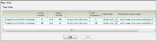
Major Ticks Time Scale table
The user interface is similar to the screen shots above, with the exception of the Enabled or Available to user checkboxes, which are not shown, and the time units displayed in the Tick units column are in the units for the current study loaded. These settings only apply to the JNB, JPG, EMF, and WMF files that are created by AutoPilot Toolkit. The settings do not apply to the WinNonlin charts that are created in the Summary_PK_Text document.
Categorical PK parameter graph X-axis split/offset
PK parameter graphs can have a Split X-axis based on individual and summary values or Offset. Administrators can make this functionality available as user options by turning on the Available to user checkbox.
Display analyte and matrix information
Matrix and analyte information can be included in the axes labels of graphs by turning on the Matrix and/or Analyte checkbox below the desired graph types. Administrators can use the Column Mapping tab to map the matrix abbreviation for concentration columns in the study data to a full name, which is displayed in the final output. The concentration column headers follow the nomenclature of [Matrix]_(AnalyteID)_CONC, where the [Matrix] defines the sample matrix. The [Matrix] information can be abbreviated in the column header; with the aid of the mapping, the entire text can be displayed in the output. For graphs, the display is included at the beginning of the y-label. Note that the Analyte name only displays in the y-label for wide (non-stacked) data.
Administrators can make this functionality available as user options by turning on the Available to user checkbox.
Administrators can set the starting points for the X-axis and Y-axis independently. The options include:
-
Force the X-axis and/or Y-axis to start from zero (ignoring negative values)
-
Force the X-axis and/or Y-axis to start from zero if all values in the set are positive values (if negative values are present, use the data values to determine the scale of the axis)
-
Use the data values to determine the scale of the axis
Administrators can select whether or not to produce separate tables for each analyte. They can also select whether or not to group table columns by treatment and then by analyte.
Suppression of summary values below LOQ
In AP Automation objects, administrators can prevent summary data values such as mean, median, etc., that fall below the LOQ from appearing in any of the following types of graphs by turning on the corresponding Suppress checkbox.
-
Plasma Time Concentration by Treatment
-
Plasma Summary Time Concentration by Treatment
-
Trough Time Concentration by Treatment
-
Trough Summary Time Concentration by Treatment
This business rule is invoked on a run-by-run basis by setting LOQ output options in the Display tab in the AP Automation object.
