The Next Generation Plots are designed to produce publication ready graphics from within Phoenix. The objects include the following, all of which can be used to create plots using imported datasets, or output data from an analysis.
Vertical Bar Plot object: To display the numeric values of categorical data. The data values of each series are represented as vertical bars, which are plotted along the horizontal axis at equally spaced intervals.
Horizontal Bar Plot object: To display the numeric values of categorical data. The data values of each series are represented as horizontal bars, which are plotted along the vertical axis at equally spaced intervals.
Box Plot object: To graphically represent groups of numerical data through their five-number summaries, which include the smallest observation, the lower quartile (Q1), the median (Q2), the upper quartile (Q3), and the largest observation.
Histogram object: To create a graphical display of a frequency distribution. Bars are used to show a count of the data points that fall into various ranges.
XY Plot object: To create scatter or line plots. It can also be used to create overlaid plots. Regression lines and error bars can be added to XY plots.
QQ (quantile-quantile) Plot object: To display the quantiles of numeric data along with a comparison distribution which is the Standard Normal, to determine how closely the data fits the normal distribution. A quantile is the percent of data points below a given value.
Categorical Scatter Plot object: To show a correlation between two or more variables. The Scatter Plot Matrix object contains all the pair-wise scatter plots of the variables on a single page in a matrix format.
Area Chart object: To show information as a series of data points connected by straight line segments, with the area between the X-axis and the line segments filled with color or a pattern. The area chart emphasizes the magnitude of change over time and can be used to highlight the total value across a trend.
Use one of the following to add a plot object to a Workflow:
Right-click menu for a Workflow object: New > Next Generation Plotting > [plot object name].
Or Main menu: Insert > Next Generation Plotting > [plot object name].
Or right-click menu for a worksheet: Send To > Next Generation Plotting > [plot object name].
Once the object is added to the Workflow, map a data source to the object.
With Next Generation Plotting objects, all customization of plot display is done from the Results panel once the object is executed.
Note:Use Next Generation Plots when your data has no blank cells (missing values). Otherwise, the resulting plot will not accurately reflect the data.
Additional information is available on the following topics:
A Next Generation Plotting object can generate multiple figures, one for each mapped data source. To add a figure/data source:
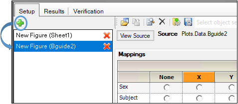
-
Click the green (+) sign.
-
Map the data source to the newly added figure.
Use the Data Mappings panel to identify how input variables are used in a Next Generation Plotting object. Separate plots can be created for each profile. Required input is highlighted orange in the interface.
None: Data types mapped to this context are not included in the output.
X: The independent variable axis. Note that, for Horizontal Bar plots, this axis is the vertical axis.
Y: The dependent variable axis.
Y2: The secondary dependent variable axis. This axis is displayed on the top of each plot.
Data Label: Labels for data points on the X axis.
Distribution: Variable used to create the Histogram plot quartiles.
Group: Only for Horizontal and Vertical Bar, Box, XY, and Area Chart plots. Groups the X axis based on the selected variable.
Grouping: Only for Categorical Scatter and Horizontal Bar plots. None: Data types mapped to this context are not grouped. Grouping Group: Displays the data points using different data point markers based on the variable mapped to this context. Any data type in a dataset can be mapped to Group even if it is also mapped to the independent and dependent variables contexts.
Lattice Conditions: Not available for Histogram plots.
•Row: Separates the plots into multiple rows based on the selected variable or variables. For example, if a dataset contains 10 subjects and the subject variable is mapped to Lattice Conditions Row, then a column of 10 rows (one row per subject) with a separate plot in each row is created in the Results tab.
•Column: Separates the plots into multiple columns based on the selected variable or variables. For example, if a dataset contains 10 subjects and the subject variable is mapped to Lattice Conditions Column, then a row of 10 columns (one column per subject) with a separate plot in each column is created in the Results tab.
•Page (Sort): Separates the plot by page based on the selected variable. Allows users to sort a plot by a variable or variables. For example, if a dataset contains 10 subjects and the subject variable is mapped to Lattice Conditions Page (Sort), then 10 separate plots are created on 10 separate pages in the Results tab.
Error Bars: Error bars represent the overall distribution of the data and are used to indicate how closely the means of the data reflect the true values. Error bars are only available for XY, Categorical Scatter plots, and for Vertical Bar plots that have no Group mapping. (See “Error bars”.) Lower Error Bar: Error bar lengths or coordinates down the Y-axis. Upper Error Bar: Error bar lengths or coordinates up the Y-axis. Different variables in a dataset can be mapped separately to the Lower and Upper Error Bar contexts.
