Graphically select data
PK Submit allows a quick look at the time vs concentration graphs of the data through a visualization tool. (Note that these graphs are provided for a visual overview of the data and cannot be saved. It is also important to clear any filters before graphically selecting exclusions so that all of the data is visible in the graph.)
Press the Visualization button at the bottom of the page.
The availability of the Visualization tool and its default settings are configurable (see “Analysis Profiles” in the configuration section.
Select a profile in the bottom table to see a time versus concentration plot of the data for all subjects in the profile.
Depending on the type of study, the graphed data will look very different due to a single data point per time point in a Serial Study versus multiple data points per time point in a Sparse Study. Remember that the type of study is specified during the “Set sampling design” step.
Serial Study: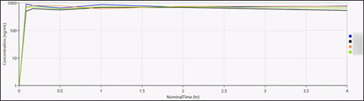
Sparse Study: 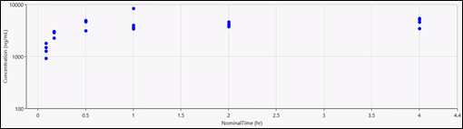
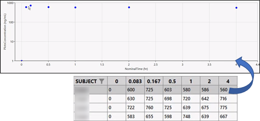
Depending on the type of study, selecting a profile in the table will display either a table of time points for each subject in the profile (Serial Study) or a table of subjects for each time point. (Sparse Study) in the lower right.
To plot a different column, use the Concentration and NominalTime menus to the right of the graph.
Select a row in the table on the right to plot only the data points for the selected item.
(You can also double-click the subject line in the profile plot of a Serial Study or select a subject point in the profile plot of a Sparse Study.)
Selecting a profile in the table will display a table of time points for each subject in the profile.
Serial Study:
Sparse Study:
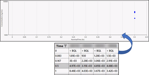
Note that plotting a single time point in a Sparse Study can help to visually separate the multiple points by changing the scaling in the graph.
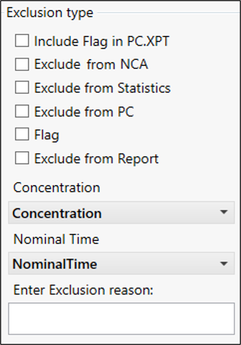
Once an exclusion selection has been made, use the checkboxes to the right of the graph to select where the exclusions are to be applied: Exclude from Report, Exclude from NCA, Exclude from Statistics, and/or Exclude from PC.
When excluding from NCA, report, or statistics, checking the Include Flag in PC.XPT box will add information in the PC domain about the exclusion.
Enter a reason for the exclusion.
Right-click a data point in the graph to exclude it.
The point changes to a red X in the graph.
Enter a reason for the exclusion or select a predefined reason from the menu.
Press the OK button to close the Visualization tool.
Any exclusions defined in the Visualization tool will be reflected in the Concentration Exclusion table as rows that are shaded pink.