Multiple profile analysis using NCA
Data for noncompartmental analyses can include one or more sort variables. Sort variables have discrete values that identify time-concentration profiles to be analyzed individually. Input datasets should be stacked (long and skinny) rather than unstacked (short and wide).
Stacking simply means moving information stored in column headings into the rows. For example, matrix data such as plasma or urine can be placed in one row, and all associated data are arranged in rows beside the matrix data. This means that all measurements appear in a single column, with one or more additional columns flagging which data belong to which matrix. The data for one matrix must be listed first, then all the data for the other matrix.
For noncompartmental analysis data, this means that time (the independent variable) and concentration (the dependent variable) data for all individuals should occupy only one column each, with one or more additional columns (sort variables) used to identify individual profiles.
This example demonstrates the general steps to summarize a dataset using noncompartmental analysis. The dataset contains time-concentration profiles from a two period crossover study with six subjects.
The study data for this example are contained in Profiles.CSV, which is located in the Phoenix examples directory. This crossover study includes two sort variables: Subject (subject identifiers) and Form (formulation). There are six subjects, each of whom was tested with two formulations, for a total of twelve profiles.The completed project (Multiple_Profiles.phxproj) is available for reference in …\Examples\WinNonlin.
Set up the project
-
Create a new project called Multiple Profiles.
-
Import the file …\Examples\WinNonlin\Supporting files\Profiles.CSV.
In the File Import Wizard dialog, select the Has units row option.
Review profile plots
Before analyzing the data, examine a plot of each profile to confirm the model and scan for outlying data points.
-
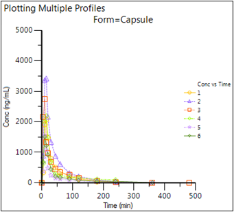
Right-click Profiles in the Data folder and then select Send To > Plotting > XY Plot.
-
In the XY Data Mappings panel:
Map Subject to the Group context.
Map Form to the Lattice Conditions Page (Sort) context.
Map Time to the X context.
Map Conc to the Y context. -
In the Options tab, with Plot selected in the menu tree, click the Title tab.
-
In the Title field type Plotting Multiple Profiles.
-
Click
 (Execute icon) to execute the object.
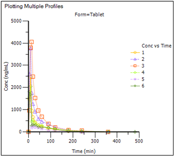
There are two formulations in the input dataset. Since Form (formulation) was mapped to the Page (Sort) Lattice Condition context, two plots are generated, each representing a formulation, and each on a separate tab. The plot for the first formulation (Capsule) is displayed automatically. -
Click the Page 02 tab to view the plot for the second formulation (Tablet).
Note:The plot display options are located in the XY Plot's Options tab. Expand items in the Options menu tree by clicking the (+) signs.
Set up the NCA object for the multiple profile analysis
The noncompartmental analysis (NCA) plasma model 200 (extravascular dosing) is suitable for this data. All subjects had a dose of 100 ng at time zero for each formulation. All profiles use uniform weighting, and allow Phoenix to select the terminal elimination phase. The linear trapezoidal method with linear interpolation is used to compute the areas under the curve.
-
Right-click Profiles in the Data folder and select Send To > NonCompartmental Analysis > NCA.
-
In the Main Mappings panel:
Map Subject to the Sort context.
Map Form to the Sort context.
Leave Time mapped to the Time context.
Map Conc to the Concentration context.
Prepare the dosing information from the multiple profiles
-
Select Dosing in the Setup list.
-
Check the Use Internal Worksheet checkbox.
Click OK in the Dosing sorts dialog to accept the default sort variables.
For each cell in the Time column, enter 0.
For each cell in the Dose column, enter 100.
Do not enter any value in the Tau column. -
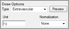
In the Dose Options area of the Options tab, type ng in the Unit field and press the Enter key.
-
Extravascular is selected by default in the Type menu. Do not change this setting.
Add a partial area calculation
-
Select Partial Areas in the Setup list.
-
Check the Use Internal Worksheet checkbox.
Click OK in the Partial Areas sorts dialog to accept the default sort variables.
For each cell in the Start Time column, enter 0.
For each cell in the End Time column, enter 120.
Specify the NCA model options for the multiple profile analysis
-
In the Options tab, the default setting for Model Type is Plasma (200-202). Do not change this setting.
-
The default setting for Calculation Method is Linear Trapezoidal Linear Interpolation. Do not change this setting.
-
In the Titles field type Processing Multiple Profiles with Model 200.
Note:The exact plasma model type (200, 201, or 202) is determined by the dose type.
Set up a user-defined parameter
-
Go to the User Defined Parameters tab.
-
Check the Include with Final Parameters checkbox.
-
Enter 75 in the field to compute the concentration at 75 minutes.
Execute and view the results of the multiple profile analysis
At this point, all of the necessary mappings and options have been specified.
-
Execute the object.
In each Results worksheet, the sort variables Subject and Form are included as columns in the data grid, and the output is presented for each level of the sort variables. See the NCA “Results” for descriptions of the output. -
Select the Observed Y and Predicted Y vs X plot in the Results tab and double-click it. The plot is opened in its own window.
-
In the Options menu tree below the plot, select Lattice under Plot.
-
Clear the Bind Lattice to Data checkbox.
-
Click the up and down arrows in the Lattice Rows and Lattice Columns boxes to change the number of rows/columns, respectively, that form the lattice.
-
Close the Observed Y and Predicted Y vs X window.
Phoenix can display a maximum of 15 latticed rows and 15 latticed columns, but no more than 200 charts per page. The number of plots that can be displayed per page depends on the monitor size and resolution. If too many plots are placed on one page the axes labels, legends, and other plot information can be difficult to read. Additional information on lattices can be found in “More on latticed plots in Phoenix”.
Summarize the multiple profile analysis output with statistics
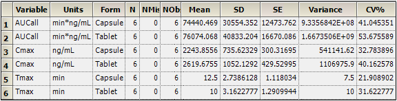
Phoenix's Descriptive Statistics object is used to summarize several of the output parameters in the Final Parameters Pivoted worksheet. The Descriptive Statistics object generates separate statistics for each formulation.
-
Right-click Workflow in the Object Browser and select New > Computation Tools > Descriptive Statistics.
-
In the Descriptive Statistics Main Mappings panel click
 (Select Source icon).
 -
In the dialog, under the NCA node, select the Final Parameters Pivoted worksheet and click OK.
-
Map:
Form to the Sort context.
Tmax, Cmax, and AUCall to the Summary context.
Leave all other data types mapped to None. -
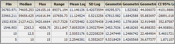
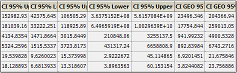
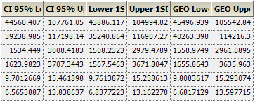
In the Options tab, check the Confidence Intervals and Number of SD Statistics checkboxes, but do not change the default values for these two items.
-
Execute the object.
This example summarizes AUCall, the area under the curve through the last measured value, Cmax, the maximal concentration of drug in the blood, and Tmax, the time at maximal concentration.
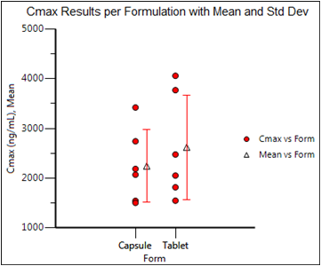
Create a Cmax plot with error bars
This section will illustrate how to use the means and SDs of data, computed by the Descriptive Statistics object, to create an overlaid plot with error bars. The Descriptive Statistics results obtained in the previous section will be filtered so that the output for only one variable (Cmax) remains. The data will then be used to create the error bars for a plot of Cmax values.
First filter the Descriptive Statistics results:
-
Right-click Workflow in the Object Browser and select New > Data Management > Data Wizard.
-
In the Options tab, select Filter from the Action menu and click Add right below the menu.
-
Click the Select Source icon in the Mappings panel.
-
In the Select Source dialog, under the Descriptive Statistics node, select Statistics, and click OK.
-
In the Options tab, click the Add button to the right of the Specify Filter field.
-
In the Filter Specification dialog, select Include as the Action.
-
Type Cmax in the Select Column or Enter Value field.
-
Make sure the Apply to entire row box is checked.
-
Click OK.
-
Execute the object.
The Result worksheet now only contains the rows of Cmax data.
Now set up the X-Categorical XY Plot object:
-
Right-click Workflow in the Object Browser and select New > Plotting > X-Categorical XY Plot.
-
Click the Select Source icon in the Mappings panel and select the NCA Final Parameters Pivoted worksheet and click OK.
-
Map:
Form to the X context.
Cmax to the Y context.
Leave all other data types mapped to None. -
In the Options tab, select Plot in the menu tree and then the Graphs sub-tab.
-
Click the Add button.
-
Select the CategoricalX 1 Data item in the Setup tab, click the Select Source icon.
-
In the Select Source dialog, under the Data Wizard node, select Result, and click OK.
-
Map:
Form to the X context.
Mean to the Y context.
SD to both the Error Bars Lower and Upper contexts.
Adjust the appearance of the plot:
-
In the Options tab, with Plot selected in the menu tree, go to the Title sub-tab.
-
Enter Cmax Results per Formulation with Mean and Std Dev in the field and click the
 icon to center the plot title.
 -
In the menu tree, select Cmax vs Form under the Graphs node.
-
Change the Marker Color to Red and set the Marker Size to 7.
-
Select Mean vs Form under the Graphs node.
-
In the Content sub-tab, check the Offset checkbox and enter 14 for the number of pixels.
-
Select the Appearance sub-tab and set the Marker Shape to Triangle.
-
In the menu tree, expand the Mean vs Form node and select Error Bars.
-
Click the Appearance sub-tab and set the Color to Red and the Cap Width to 9.
-
Execute the object.
The output is an overlay of two graphs (Cmax vs Form and Mean vs Form) that includes error bars.
Export results to Microsoft Word
The results of any operational object can be exported to a Microsoft Word document. This example shows how to format plot output and export it to Microsoft Word. By default, plots are exported at a resolution of 1024 by 768 pixels.
-
Select File > Word Export.
-
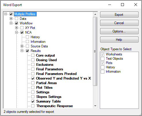
In the Word Export dialog, click the (+) signs beside Workflow > NCA > Results to expand the menu tree.
-
Select the Observed Y and Predicted Y vs X checkbox.
-
Select the Summary Table checkbox.
-
Click Options.
-
Select the Landscape option button in the Document tab.
-
Make sure the Add source line to objects checkbox is cleared and click Finished.
-
Click Export.
Phoenix creates a new Microsoft Word document and exports the selected objects into the document. -
In the Export Complete dialog, click OK.
-
Save the Word file and exit Microsoft Word.
-
Close the project by right-clicking the project in the Object Browser and selecting Close Project.