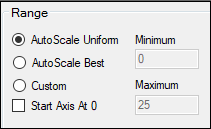
Select Axes > X, Y, or Y2 in the tree, then click the Content tab.
Options for setting the range are fairly consistent across plot objects.

Choose an autoscaling method for determining the axis range.
AutoScale Uniform creates a uniform axis scale across all plots when there are multiple pages, rows, or columns of plots. In some plots, this option can cause the axis to extend past the highest data point or below the lowest point, since the largest range needed is used. (This option does not apply to Scatter Plot Matrix.)
AutoScale Best creates the best axis scale for each individual plot, based on the number of data points and the values used.
Custom allows manual entering of the range for the axis. This option is available for the Y- and Y2-axes for all plot objects and the X-axis for QQ, Scatter Plot Matrix, and XY Plots.
a. Enter the starting point (i.e., the lowest value on the axis) in the Minimum field.
b. Enter the end point (i.e., the highest value on the axis) in the Maximum field.
c. In the Major field (under Divisions), enter number of numerically labeled tick marks to display on the axis.
d. In the Minor field, enter the number of unlabeled tick marks to show on the axis.
For axes that are continuous, if either auto-scale option is selected and Linear scaling is specified, check the Start Axis At 0 box to force the axis numbering to start at 0, regardless of the data being plotted.