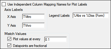
Specify how plot labels are displayed.

Check the Use Independent Column Mappings Names for Plot Labels box to use the dataset variables mapped to the Independent contexts in the InVitro and InVivo mapping panels as the plot labels.
Enter any custom labels for the axes or legend.
Check the Plot Values at every box create a plot of interpolated time values at regular intervals across the sample data.
The first value is displayed at Y=0, then points are plotted at the specified interval until the end of the sample data range. The maximum Y value displayed is the lesser of the maximum observed fraction dissolved and the calculated fraction absorbed.
Checking this option overwrites any custom times values entered in the internal worksheet in the Match Values mapping panel, but has no effect if an external worksheet is used.
Check the Datapoints are fractional box if the data are expressed as fractions (Phoenix multiplies the values by 100 before plotting).
Uncheck the box if the independent variable is in decimal format.