Continuous observed variable tab(s) options
The options provided below are the ones for a continuous observed variable with a model involving categorical covariates.

-
Specify the variable to use for the X axis in the predictive check plots from the X axis pull-down menu.
t is time (the default)
TAD is time after dose
PRED is population (zero-eta) prediction
other… displays a field to type in the name of any other variable in the model
Prediction intervals, or the quantiles of the predictive check simulation, might not be very smooth if there are many time deviations in the dataset. The predictive check has the option whether or not to bin the independent variable.
-
Select the binning method to use from the Binning option pull-down menu. Different binning methods can be specified for different dependent variables.
•None: Every unique X-axis value is treated as its own bin (the default method)
•K-means: Observations are initially grouped into bins according to their sequence order within each subject. Then the K-means algorithm rearranges the contents of the bins so every observation is in the bin that has the nearest mean X value or “center of gravity.” Starting with an initial set of bins containing observations (with a mean X value of these observations), the K-means algorithm:
1) transfers each observation to the bin with the closest mean to the observation, and
2) recalculates the mean of each bin. This is repeated until no further observations change bins. Bins that lose all their observations are deleted.
•Explicit centers: Specify a series of X values to use as the center values for each bin. Observations are placed into the nearest bin.
•Explicit boundaries: Specify a list of X value boundaries between the bins. Observations are placed in the nearest bin. The center value of each bin is taken as the average X value of the observations in the bin.
In the case of Explicit centers and Explicit boundaries, the numerical values, separated by commas, are automatically sorted into ascending order and duplicates are eliminated. In all cases, bins having no observations are eliminated.
-
Check the Override Main tab stratification checkbox (available when the model involves categorical covariates) to override stratification rules defined in the Main tab, if it is needed.
When Override Main tab stratification is checked, use the Stratify menu to select a defined categorical covariate. The stratas are applied for the current dependent variables only. -
Check the BQL checkbox (available when BQL is specified in the model and None is chosen in the Pred. Corr. pull-down menu) and select an option from the menu to specify the way BQL data is handled. (Only available if the BQL? checkbox in the Structure tab is checked or the argument is included in textual mode).
•Select Treat BQL as LLOQ to replace BQL data less than the LLOQ value with the LLOQ value in Observations and related worksheets.
•Select BQL Fraction from the menu to have the amount of BQL data checked and its fraction compared with the quantile level. If the fraction of BQL data is more than the defined quantile, the corresponding observed data are not shown in the VPC plot (Pop PredCheck ObsQ_SimQCI/ Pop PredCheck ObsQ_SimQ) or in PredCheck_ObsQ_SimQCI/ PredCheck_SimQ worksheet. However, the data can be viewed in the BQL fraction plot.
-
In the Quantile % field, accept the default quantiles or enter new ones.
Separate multiple quantiles by commas. For example, 10,50,90. The default quantiles are 5, 50, and 95. Different quantiles can be specified for different dependent variables. -
Check the Quantile checkbox to include predicted quantiles confidence intervals in the predictive check output. If this option is not checked for a dependent variable, then the associated plot will be the same as the Pop PredCheck ObsQ_SimQ plot.
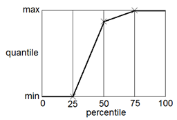
The quantiles are the summary statistic measures provided by the predictive check. There are multiple ways to calculate quantiles, given percentiles and a data set. NLME uses the same method as SPSS, and R’s quantile function with type=6. The following diagram illustrates the quantile function in the case of a dataset containing three numbers. The numbers are sorted in ascending order. If there are N numbers, there are N+1 intervals. Percentiles (expressed as fraction F) falling below 1/(N+1) or above N/(N+1) have a quantile equal to the minimum or maximum, respectively. Otherwise, the quantile is found by linear interpolation.

Users can optionally select to calculate confidence intervals for the predicted intervals, or predictive check quantiles. Since each simulated replicate is like the original dataset, first the quantiles are obtained at each stratum-bin-time for each replicate. For each stratum-bin-observed quantile, users get a cloud, one for each replicate. Then quantiles of the quantiles are calculated by stratum-bin-time over all replicates corresponding to a confidence interval of the simulated quantiles.
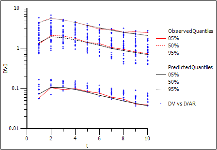
With predictive check, there is one level of simulated quantiles of observations (e.g., the values entered in the Quantile % field). During simulation, the model is purposely disturbed so that the predicted values of the observations fall in a range. The intent is to determine if the range includes the actual observations that came in on the original data. The Pop PredCheck ObsQ_SimQ plot shows the simulated quantiles:

The blue dots are the actual original observations. The red lines are 5%, 50%, and 95% quantiles from the actual original observations. The black lines are the 5%, 50%, and 95% quantiles from the simulated observations. The example plot above shows a good match between them.
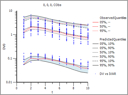
Sometimes the user wants to determine the confidence level of the simulated quantiles. To see how much the simulated quantiles are themselves variable, check the Quantile checkbox. This provides an additional plot of confidence intervals of the simulated quantiles (Pop PredCheck ObsQ_SimQCI plot).

In place of each simulated quantile black line, there are two black lines, representing the 10% and 90% confidence intervals of that quantile. The shading aids in visualizing the variation. Notice how the red lines fall inside the black lines (i.e., within the shaded area), which is a positive result.
