The results are displayed on the Results tab. The option buttons selected in the Data Mappings panel and the options selected in the Options tab determine the number of plots that are created in the Results tab. A Settings file is also generated containing all selections made in the object interface.
A plot can be viewed and modified in its own window by selecting it in the Results list and double-clicking it or pressing ENTER. Once a result is displayed in its own window, the object can be re-executed by clicking ![]() in the toolbar.
in the toolbar.
Double-clicking a point in an XY plot, bar plot, or scatter plot matrix plot opens the worksheet for that plot in a separate window, with the row corresponding to the double-clicked point highlighted.
For all plot types except scatter plot matrix, click various parts of the plot image to go to the options associated with that part of the plot output. (See “Plot Options tab” for more details on the options available.)
|
Click: |
To display: |
|
X axis |
X axis menu |
|
Y axis |
Y axis menu |
|
Y2 axis (not present in all plots) |
Y2 axis menu |
|
Title |
Title text field |
|
Legend |
Legend menu |
|
Bar, Column, QQ Marker, |
Graphs menu Appearance tab |
|
Box, Bin, XY Line |
Graphs menu Content tab |
Place the pointer over part of the plot to view a popup showing associated data:
|
Position point over: |
To see: |
|
Bar |
Data point used to create the bar |
|
Part of a box plot |
Data point associated with that quartile |
|
Part of a histogram |
Data point associated with that part of the bin |
|
Marker or Line |
Data point used to create the marker or line |
Additional information on Box Plot results
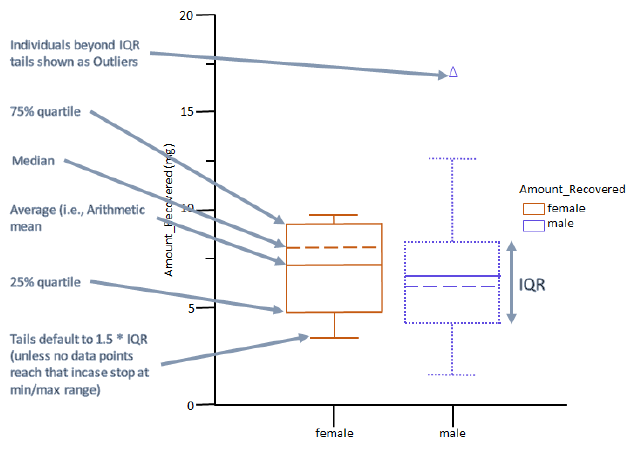
In the Box plot, the dashed line is the median; the solid line is the arithmetic mean. The ends of the “box” are the 25th and 75th percentiles, which are computed by the same method as in Descriptive Stats. These are also referred to as the first and third quartiles. The whiskers show the lowest data value still within 1.5 IQR of the lower quartile, and the highest value still within 1.5 IQR of the upper quartile, where IQR is the interquartile range (the difference between the third and first quartiles, the middle 50%). Custom Whisker IQR factor option in the Content tab allows the user to change the multiplier of IQR to a value other than 1.5.
Data values that do not fall between the whiskers are plotted as outliers (markers outside of the whiskers). Profiles with fewer than five data points plot the data points directly with no box.

Interpreting a box plot with whiskers
